I am a firm believer in serendipity- all the random pieces coming together in one wonderful moment, when suddenly you see what their purpose was all along.
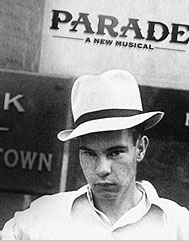
But it's not a bad poster. But it's not a great one either. There's nothing special about it. A poster can be simple and effective. That one is just simple.
"Sing the words, Patti!!!!" Stephen Sondheim to Patti LuPone.
I'm sure it will change. However, I think it looks cool. I think it does look a little cheap though. I can't tell if they were going for cheap or vintage lol. It doesn't matter. Everyone knows the show and it will probably do pretty well.
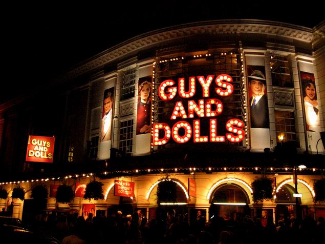
I am amused because I just realised the recent Melbourne production of "Guys & Dolls" basically just ripped off the London artwork. In fact it was worse - It was a direct copy-and-paste.
I am amused because I just realised the recent Melbourne production of "Guys & Dolls" basically just ripped off the London artwork. In fact it was worse - It was a direct copy-and-paste.
Was it really a rip off or just a Melbourne mounting of the London production with the same creative team and producers and thus the same logo?
I like the new artwork. It's very retro. It's a lot better looking than putting some light bulbs inside the font. Anyway, I'm excited to see the show. I've never seen Guys and Dolls before.
I am not that enamoured by the the new artwork. The original remains the best I think along with the National Theatre logo. That production also, for me, was the greatest production (I didn't see the original). Have many happy memories of 4am queues for day seats - people used to sleep overnight - it was that much of a hit. A sublime cast - McKenzie, Hoskins, Charleson,Covington and wonderful actors in smaller roles like Imelda Staunton and Bill Paterson.The NT was in my opinion better than the Lane/Prince revival and much, much better than the Donmar production. Mama - no matter how many times you say it, the font used on Guys is not the NT one.