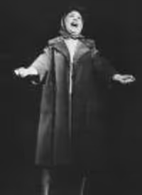
Lupone Gypsy Poster
#50re: Lupone Gypsy Poster
Posted: 1/7/08 at 9:52pmno poroblem ljay889, it's frustrating if someone gets really preachy with no source to back it all up.
#51re: Lupone Gypsy Poster
Posted: 1/7/08 at 9:54pmWow that really is terrible. Why must it be so... blue!? I much prefer the City Center logo.
mauriposa
Broadway Legend Joined: 12/14/05
#52re: Lupone Gypsy Poster
Posted: 1/7/08 at 9:58pmThis would be great if it were a 10th grader's final project in his graphic design class. As a Broadway poster, on the other hand ...
DaneSaw
Stand-by Joined: 5/31/07
#54re: Lupone Gypsy Poster
Posted: 1/7/08 at 10:04pmDear god. I know a professor of mine whose head will explode when he sees this.
RetroBoy
Broadway Star Joined: 10/1/07
#55re: Lupone Gypsy Poster
Posted: 1/7/08 at 10:04pmIt's CRAPTASTIC and I doubt this is the official one. There's just NO WAY.
#56re: Lupone Gypsy Poster
Posted: 1/7/08 at 10:07pm
I agree! There is no way this could be the official poster. Someone needs to email Patti and ask, she'll prob. asnwer too.
I still can't understand why they would use a picture from Ravinia?
RyToast1
Broadway Legend Joined: 5/27/07
#56re: Lupone Gypsy Poster
Posted: 1/7/08 at 10:07pmRetroBoy-I'm with you...this cannot be the final poster!
#58re: Lupone Gypsy Poster
Posted: 1/7/08 at 10:08pm

Loops is photoshopped to hell.
They took out the odd armpit ventilators, smoothed out the dress, slimmed her down, changed the color of the dress and brightened her skin tone throughout.
Atrocious.
RyToast1
Broadway Legend Joined: 5/27/07
#59re: Lupone Gypsy Poster
Posted: 1/7/08 at 10:10pmI think Patti's gonna have a sh*t fit when she sees that poster.
Trish2
Broadway Legend Joined: 8/20/06
#60re: Lupone Gypsy Poster
Posted: 1/7/08 at 10:10pm

and the season's worst poster award goes to....
Take your pick.
#61re: Lupone Gypsy Poster
Posted: 1/7/08 at 10:10pmThis cannot be the final poster. It is just too terrible. I hope they use the image of her belting it out from City Center.
RyToast1
Broadway Legend Joined: 5/27/07
#62re: Lupone Gypsy Poster
Posted: 1/7/08 at 10:10pmI think the Gypsy poster is 5 billion times worse than the In The Heights poster.
#63re: Lupone Gypsy Poster
Posted: 1/7/08 at 10:12pm
I think the IN THE HEIGHTS poster is gorgeous.
Trish is paid to write bad things about the show, so her opinion is irrelevant.
-Kad
"I have also met him in person, and I find him to be quite funny actually. Arrogant and often misinformed, but still funny."
-bjh2114 (on Michael Riedel)
#64re: Lupone Gypsy Poster
Posted: 1/7/08 at 10:14pm
Yea, I haven't seen "In the Heights" and that poster makes me want to.
Much more than the poster from Off-Broadway.
It looks fun, exciting and shows alot of the cast which is cool.
LadyRosecoe
Broadway Star Joined: 8/4/07
#65re: Lupone Gypsy Poster
Posted: 1/7/08 at 10:14pmI'm still giggling about someone saying her leg not being able to twist that way when it was probably the only thing that wasn't photoshopped from that original picture. Both that fact and the angle of the leg are quite amusing.
#66re: Lupone Gypsy Poster
Posted: 1/7/08 at 10:15pmI actually like the In The Heights poster. The Gypsy poster, on on the other hand, is terrible. It looks like a Company poster reject. It looks a little better without Lupone, but not much.
#67re: Lupone Gypsy Poster
Posted: 1/7/08 at 10:17pmI love the In The Heights poster. I did not see it Off-Broadway and have heard amazing things and that poster makes me want to see it more.
#68re: Lupone Gypsy Poster
Posted: 1/7/08 at 10:39pmI love that image of her from "Rose's Turn", but I think the poster as a whole could stand some fix ups.
#69re: Lupone Gypsy Poster
Posted: 1/7/08 at 10:42pm
Add me to the list of those hoping this isn't the final poster. It's fairly atrocious. Whoever suggested the idea of a graphic with a real vintage look, brava! I would love to see something like that here. Furthermore, to use a photo from an entirely different production is a joke. I don't know why the folks behind this production would choose to showcase her Ravinia look/photo, let alone why they're ALLOWED to use it(copyright, etc.).
And by the way, I love me some P. LuPone, but that's some billing she's contracted! Her name is so large, it appears as if the title of the piece is: "Patti LuPone Gypsy."
Robos89
Broadway Legend Joined: 6/20/06
#71re: Lupone Gypsy Poster
Posted: 1/7/08 at 10:47pmThey also took the straps off of her character shoes...
LadyRosecoe
Broadway Star Joined: 8/4/07
#72re: Lupone Gypsy Poster
Posted: 1/7/08 at 10:51pmAlthough I'm a fan of T-straps, I do find it looks nice without them, but in the grand scheme if that is the best thing I have to say about the poster....
ashley0139
Broadway Legend Joined: 1/3/05
#73re: Lupone Gypsy Poster
Posted: 1/7/08 at 10:56pmEw. I'm seriously disappointed in this poster.
RyToast1
Broadway Legend Joined: 5/27/07
#74re: Lupone Gypsy Poster
Posted: 1/7/08 at 11:24pm
"Her name is so large, it appears as if the title of the piece is: 'Patti LuPone Gypsy.'"
At City Center, the title WAS LuPone Gypsy.
#75re: Lupone Gypsy Poster
Posted: 1/7/08 at 11:28pm
Wait, the show listing page has it without the crappy pic, is it possible that someone decided that the Stage Notes version needed a crap-up? Or that Paul Wontorek was playing photoshop before writing the blog and uploaded the wrong pick???
I normally wouldn't question this, but its sooooooooooooooooo ugly.
With Clay Aiken in Spamalot, all of Broadway is singing a collective "There! Right! There!" -Me-
"Not Barker, Todd is the only person I've ever known who could imitate Katherine Hepburn...in print." -nmartin-
Videos
