What are you favorite/least favorite Show Logos?
#0What are you favorite/least favorite Show Logos?
Posted: 7/15/03 at 12:30pmWhenever a show is advertised, their logo show up. Sometimes it's a picture, or a fancy way of writing the title of the show. What are your favorite Logos? I like Thoroughly Modern Millie's picture of Millie in the red dress and Hairspray's, with each letter surrounded a block of color. I also like the revival of Into the Woods with the storybook serving as trees, and Little Red's cloak sticking out. Zanna Don't!'s logo is awesome, too. The Z has a lightning bolt at the bottom. My least favorites are the Nine's revival logo and the revival of Man of La Mancha's. They aren't very colorful, or interesting to look at.
PJ
Broadway Legend Joined: 5/15/03
#1re: What are you favorite/least favorite Show Logos?
Posted: 7/15/03 at 12:52pmI like Gypsy's and Man of La Mancha's. I like La Mancha's because I really like how they made the title into the shape of a horse, which I thought was kind of cool. It's not very colorful, yes, but an interesting design none the less. Updated On: 7/15/03 at 12:52 PM

SueleenGay
Broadway Legend Joined: 6/9/03
#2re: re: What are you favorite/least favorite Show Logos?
Posted: 7/15/03 at 1:02pmI love the WICKED logo. I think it is brilliant.
PEACE.

Oscar Jaffee
Stand-by Joined: 5/15/03
#3re: re: re: What are you favorite/least favorite Show Logos?
Posted: 7/15/03 at 1:12pmMy all-time favorite logos are "On the Twentieth Century" and "Sweeney Todd." As far as the logo for the "Man of La Mancha" revival, I think it's very creative.
#4re: re: re: re: What are you favorite/least favorite Show Logos?
Posted: 7/15/03 at 1:46pmThere's another one: Wicked~ I think it's ansolutely awesome and works so well and really makes the person think.
BwayTheatre11
Broadway Legend Joined: 6/25/03
#5re: re: re: re: re: What are you favorite/least favorite Show Logos?
Posted: 7/15/03 at 2:14pmMy favorites are Footloose, Rent, Modern Millie, and Aida. I like them because they are just visually appealing, I guess. They all have different qualities I like. My least favorite are Man of La Mancha and some others I really can't think of. They are kind of boring.
CCM '10!
#6re: What are you favorite/least favorite Show Logos?
Posted: 7/15/03 at 2:27pm
my favorite:
On The Twentieth Century
my least favorite:
Evita
"MAY YOUR LIFE BE AS BRIGHT AS BROADWAY AT NIGHT"
Broadway Star Joined: 12/31/69
#7re: re: What are you favorite/least favorite Show Logos?
Posted: 7/15/03 at 3:26pm
Love Miss Saigon Logo how the helicopter becomes Kim's face
Aspects of Love
how the heart shaped face of the blindfolded woman becomes two people kissing
Updated On: 7/15/03 at 03:26 PM
#8What are you favorite/least favorite Show Logos?
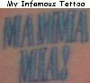
Posted: 7/15/03 at 3:34pmMamma Mia - only have it tattooed on me
~*~ Little Boys Who Play With Fire Get Their Fingers Burned ~*~ Tanya (Mamma Mia)
Cadriel
Featured Actor Joined: 5/12/03
#9re: What are you favorite/least favorite Show Logos?
Posted: 7/15/03 at 3:37pm
My favorite, I know, is the original London logo for Chess (with "CHESS" written in stately letters at the top, and featuring a chessboard dissolving into chaos to the left and down against a black background). I've something of a fondness for the spy novel style logo from the 1988 Broadway logo, but the original is still the best. (Variations on it, such as the Danish Tour and the Stockholm cast recordings, are cool too.)
-Wayne
Juliette Capulet
Featured Actor Joined: 5/28/03
#10re: What are you favorite/least favorite Show Logos?
Posted: 7/15/03 at 3:56pm
"Romeo et Juliette ~ de la Haine a l'Amour" has my favorite logo. I haven't really seen any logo's I hate, so I can't answer.
Tendres Baisers,
Juliette Capulet

#11re: What are you favorite/least favorite Show Logos?
Posted: 7/15/03 at 4:58pm
I enjoyed the Victor/Victoria logo (minus the photo...) I thought it was cute. But my favorite probably is Side Show, with the whole crowd in black and white. But I'm impartial to that show anyway!
As for Evita, I love that show, but you have to remember that the logo was unveiled in 1979, and while it IS about Eva and her life, essentially, it's a political musical so I think the logo is fitting.
Mamma Mia's is kinda boring I think. I will say that DeWynters, who does most of ALWebber's stuff, and Cameron Makintosh's stuff is very clever and creative (Miss Saigon, Phantom, Sunset, Joseph, etc.)
What I don't understand about the Phantom logo is sometimes there's a rose and the mask with the lettering...
I've seen the show enough times to ask: Where the hell's the rose in the show? There's no significance, but yet, it's part of the logo!!! Oh well... They did something right, it's still raking in the $$$!
Gothampc
Broadway Legend Joined: 5/20/03
#12re: What are you favorite/least favorite Show Logos?
Posted: 7/15/03 at 5:05pm
Teacheroftheater, what's the matter with you? I've always liked the Evita logo.
I also liked the "Shenandoah" logo and have the showbill (at one time they were made of cardboard) hanging on my wall. It was penned like a patchwork quilt.
If anyone ever tells you that you put too much Parmesan cheese on your pasta, stop talking to them. You don't need that kind of negativity in your life.
#13re: re: What are you favorite/least favorite Show Logos?
Posted: 7/15/03 at 6:30pm
Big surprise from me....
Fav is Scarlet Pimpernel 2.0 and later...not the first one!
Least Favorite was the recent revival JCS.
addition to the serenity prayer:
Help me hide the bodies of the people I had to kill because they pissed me off!!! :-)
alterego
Broadway Legend Joined: 6/5/03
#14re: What are you favorite/least favorite Show Logos?
Posted: 7/16/03 at 8:53am
I love any logo's that feature artwork by Hilary Knight (also respondsible for the sketches in the Eloise books). His work includes the logo's for...
No, No, Nanette
Irene
Sugar Babies
Hallelujah, Baby
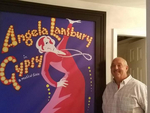
Gypsy (Lansbury the best logo for this show by far).
Of the current crop I like Nine and Hairspray. I found Millie's a bit disapointing.
#15re: re: What are you favorite/least favorite Show Logos?
Posted: 7/16/03 at 6:46pm
Favorite: Phantom & DOTV
Least Favorite: Thoroughly Modern Millie (Although I do wanna see it!!!)
"Life will be frozen peaches and cream.
Baby, dream Your Dream" ~ SC

#16re: What are you favorite/least favorite Show Logos?
Posted: 7/16/03 at 6:52pmI really don't like the revival logo for Gypsy, Even though I LOVE LOVE LOVE the show. But I do like all of the Into the Woods logos and the orginal Gypsy logo
Be careful the things you wish for, they may just come true.- The Witch, ITW
jo
Broadway Legend Joined: 5/15/03
#17re: re: What are you favorite/least favorite Show Logos?
Posted: 7/16/03 at 7:44pm
Impressive/Stylish :
Les Miserables
Aspects of Love
Man of La Mancha
Nine
Forgettable:
Too many to mention ![]()
jo
Dollypop
Broadway Legend Joined: 5/15/03
#18re: re: re: What are you favorite/least favorite Show Logos?
Posted: 7/16/03 at 9:57pmWhenever I see the MILLIE logo I want to check to see whether Millie has shaved under her arms.
"Long live God!" (GODSPELL)
CourtneyM
Leading Actor Joined: 5/11/03
#19re: re: re: re: What are you favorite/least favorite Show Logos?
Posted: 7/16/03 at 10:27pmmy favorites are enchanted april, dotv, take me out and wicked
One should either be a work of art, or wear a work of art-Oscar Wilde
Updated On: 7/16/03 at 10:27 PM
#20re: re: re: re: re: What are you favorite/least favorite Show Logos?
Posted: 7/16/03 at 10:57pmEnchanted April's is nice as well. I also like the original Into the Woods logo. With the title hidden in the trees.
SONDHEIM8
Understudy Joined: 6/23/03
#21re: What are you favorite/least favorite Show Logos?
Posted: 7/17/03 at 4:05pm
MY FAIR LADY
A CHORUS LINE
DREAMGIRLS
They all captured the essence of the show.
LINK: Tracy,you look beautiful behind bars!
TRACY: It must be the low-watt institutional lighting!
sondheimfreak
Featured Actor Joined: 7/13/03
#22re: What are you favorite/least favorite Show Logos?
Posted: 7/25/03 at 10:55am
Here are some I like:
Cabaret~ (revival) with the Emcee's face
Cats~ love the eyes!
Into the Woods~ OBC and Revival
Jekyll and Hyde
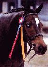
Man of La Mancha ~(revival) I also like the horse.
The Producers
Ragtime
Rent
Sweeney Todd
West Side Story~ (film)
Here are some I don't:
Annie
Big River
Chicago
Into the Woods~ London
Kiss Me Kate ~ Revival
The Lion King
Little Shop of Horrors
The Music Man ~OBC
Oliver!
Sunday in the Park with George
"I don't understand. Everything's coming up Roses' WHAT?"-Jerome Robbins to Stephen Sondheim
#23re: re: What are you favorite/least favorite Show Logos?
Posted: 7/26/03 at 11:45amRagime and Rent have great logos, but Oliver isnt that bad either. Well, the original is, but there was one version with Fagin's face. It was red, and I think the title was hidden in its eyes or something. That was a cool logo.

Rypm25
Stand-by Joined: 5/21/03
#24What are you favorite/least favorite Show Logos?
Posted: 7/26/03 at 9:44pmMy favorite would have to be "Nick & Nora"...the show may have been a mess...but what a classy logo!
Videos