

Gypsy marquee
seymour krelborn
Broadway Star Joined: 5/14/03
#1Gypsy marquee
Posted: 1/27/08 at 11:57am
I'm sorry I don't have pictures, but to anyone who has seen it I have one question. Does it look blurry and out of focus? I thought so and I was wondering if it was just me. I also love the sign which reads "Patti Lupone in the role she was born to play"
Updated On: 1/27/08 at 11:57 AM

#2re: Gypsy marquee
Posted: 1/27/08 at 12:00pm
oh my god. I was on Broadway yesterday...I was thinkin' of checking the St. James...if the marquee was up...but its just waayyy to cold, for me to walk from 50th Street (Winter Garden) to St. James.. and I wont be back till the weekend of 2/2 for APPLAUSE & PASSING STRANGE. ![]()
J*
Updated On: 1/27/08 at 12:00 PM

#2re: Gypsy marquee
Posted: 1/27/08 at 12:19pm

That's the picture I have. It was taken with my phone though. It is a TINY bit blurry but not in a bad way. I think it's just because of the way they wrote it in "lights".
"Wishes come true, not free..."
Updated On: 1/27/08 at 12:19 PM

zooxanthellae
Broadway Star Joined: 6/2/07
#3re: Gypsy marquee
Posted: 1/27/08 at 12:39pmIts too bad that its so small, its a little underwhelming... hopefully they'll add more later!
RyToast1
Broadway Legend Joined: 5/27/07
#5re: Gypsy marquee
Posted: 1/27/08 at 2:02pm
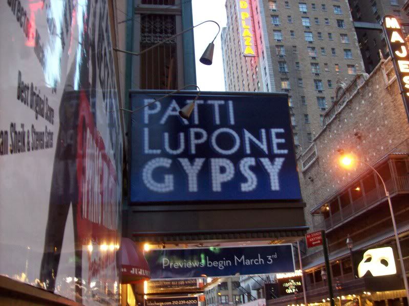
This picture is a little clearer. It's not horrible, but a bit boring.
The choice may have been mistaken, The choosing was not... "Every day has the potential to be the greatest day of your life." - Lin-Manuel Miranda
#6re: Gypsy marquee
Posted: 1/27/08 at 2:06pmThe most underwhelming marquee on Broadway!
A young actress with Noel coward after a dreadful opening night performance said to him 'Well, i knew my lines backwards this morning!''
Noels fast reply was ''Yes dear, and thats exactly how you said them tonight'!'
Robos89
Broadway Legend Joined: 6/20/06
#7re: Gypsy marquee
Posted: 1/27/08 at 2:07pmForgive me for asking, but what played in the St. James prior to Gypsy?
?
BroadwayPer4mer03
Stand-by Joined: 2/14/04
Stand-by Joined: 12/31/69
RyToast1
Broadway Legend Joined: 5/27/07

#11re: Gypsy marquee
Posted: 1/27/08 at 2:14pm
I, personally, like it.
It's very straightforward and since I'm an incredibly boring person, I like that. ![]()
The show's about having your name in lights and hey, "Gypsy" is written in "lights!" :)
Call me Travis. :)

#12re: Gypsy marquee
Posted: 1/27/08 at 2:31pm
At "Xanadu" last night, and Boyd Gaines walked by and was checking out the "Gypsy" marquee- He didnt seem too impressed !
It looks awful, but something tells me this wont be the permanent one. It just looks horrid !!!
#13re: Gypsy marquee
Posted: 1/27/08 at 2:34pmIt does look pretty bad, but why would they put it up if they weren't going to keep it?
The choice may have been mistaken, The choosing was not... "Every day has the potential to be the greatest day of your life." - Lin-Manuel Miranda
#14re: Gypsy marquee
Posted: 1/27/08 at 2:36pm
I guess.. my source is wrong...
It looks like that's the FINAL ARTWORK....Let's wait for the official playbill!
Testing is RIGHT.. its the PERMANENT ONE.. They are not going to put one up temporary and remove it...
J*
Updated On: 1/27/08 at 02:36 PM
#15re: Gypsy marquee
Posted: 1/27/08 at 2:57pmUnderwhelimng.
"I saw Pavarotti play Rodolfo on stage and with his girth I thought he was about to eat the whole table at the Cafe Momus." - Dollypop
zooxanthellae
Broadway Star Joined: 6/2/07
#16re: Gypsy marquee
Posted: 1/27/08 at 3:04pm
It's not that bad... it just doesn't catch the eye...at all! It's much too simple... Who picked blue as the main colour?
They really should have kept the city center logo... it was simple, but looked amazing! Not the mention it certainly caught the eye.
Updated On: 1/27/08 at 03:04 PM

#17re: Gypsy marquee
Posted: 1/27/08 at 3:11pmI feel that the GYPSY part of the Marquee needs to be a tad bit bigger than PATTI LUPONE. Just my opinion.
Gypsy - Betty Buckley
http://www.youtube.com/watch?v=tUN5XoB5vFs&feature=youtu.be

#18re: Gypsy marquee
Posted: 1/27/08 at 3:16pmI don't see what's so awful about it. There's no reason to wallpaper the outside of theaters with pictures and bright colors and purple iridescent mirrors. It's too much. I'm glad it's just straight forward, clean, and clear.
"If you are going to do something, do it well. And leave something witchy."
-Charlie Manson
Broadway Legend Joined: 12/31/69
#19re: Gypsy marquee
Posted: 1/27/08 at 3:21pmit just seems blue is such an odd choice....deep reds, i could understand.
#20re: Gypsy marquee
Posted: 1/27/08 at 3:26pmI think it's too dull to be awful.
"Some people can thrive and bloom living life in a living room, that's perfect for some people of one hundred and five. But I at least gotta try, when I think of all the sights that I gotta see, all the places I gotta play, all the things that I gotta be at"
Ed_Mottershead
Broadway Legend Joined: 10/20/05
#21re: Gypsy marquee
Posted: 1/27/08 at 3:40pmThe picture that was taken from across street looks like it could be just as much a promo for Spring Awakening; the Gypsy one really gets lost. I agree that they should have used the one that was on the program last summer at Encores!
BroadwayEd

#22re: Gypsy marquee
Posted: 1/27/08 at 3:42pm
The font and size are fine to me, however blue is a cold color and the show has such fiery and passionate characters, therefore a rich old fashioned-like curtain red would have been better.
The City Center logo was great.
"You never really understand a person until you consider things from his point of view - until you climb into his skin and walk around in it."
To Kill A Mockingbird
To Kill A Mockingbird
SDav 10495
Broadway Star Joined: 7/21/06
#23re: Gypsy marquee
Posted: 1/27/08 at 3:45pm
If this is the marquee, it's most certainly the permanent design. So why are so many people suggesting that it's only temporary? Could be denial, but more likely it's just the fact that this design lends the production no feeling of permanence whatsoever. It looks like a fake revival slapped together simply so Patti can say she played Rose on Broadway. It's so bland and careless you really get the sense that the production's reason for existing is not to give the audience something meaningful but to make the star's dream come true.
I have no doubt that what goes on inside the theater will be great, but this ad campaign gives me little reason to think that I'd be getting my money's worth if I bought a ticket.
"If there is going to be a restoration fee, there should also be a Renaissance fee, a Middle Ages fee and a Dark Ages fee. Someone must have men in the back room making up names, euphemisms for profit."
(Emanuel Azenberg)
friedrichVT
Leading Actor Joined: 5/4/06
#24re: Gypsy marquee
Posted: 1/27/08 at 3:53pmIm sure its negotiated in Patti's contract that her name be the same size font as the title. Its common for stars. So the title will probably never be bigger on the marquis.
Videos