Early unused Wicked poster designs!
#0Early unused Wicked poster designs!
Posted: 3/14/04 at 12:39pmIn the Broadway photos section of http://www.wickedonbroadway.net, one can see some unused Wicked posters that were created when the show started. It's INCREDIBLY interesting, and I like 1 or two of them a little bit more than the current poster. How do you feel about these?
Broadway Legend Joined: 12/31/69
#1re: Early unused Wicked poster designs!
Posted: 3/14/04 at 1:34pmwow that WAS really cool, but then i'm sure the producers wanted glinda on the poster. see in the book glinda has a smaller role, but in the musical she shares the bill!
#2re: re: Early unused Wicked poster designs!
Posted: 3/14/04 at 1:47pmNeat photos. I liked the one with the same font and the two witches on opposite sides.
#3re: re: re: Early unused Wicked poster designs!
Posted: 3/14/04 at 1:48pmI personally like the third one down. The first one looks too much like Harry Potter.
#4re: re: re: re: Early unused Wicked poster designs!
Posted: 3/14/04 at 1:59pm
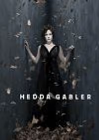
I like the fourth one down where Elphaba is outlined with tree branches. It's very interesting.
From the time I first saw the Broadway ad, in October, to the time I saw it on Broadway in January, I always thought the Broadway poster was just Elphaba touching her hat. I never realized until I saw the show that the white part is Glinda. Just goes to show how little I observe!
#5re: re: re: re: re: Early unused Wicked poster designs!
Posted: 3/14/04 at 2:22pmI really like the second and third ones, and I agree with Bret that the first one looks too much like Harry Potter. That was really interesting. Thanks for the link!
#6re: re: re: re: re: re: Early unused Wicked poster designs!
Posted: 3/14/04 at 2:30pmwoa, i was thinking Harry potter when i saw the 1st poster too, (without reading what you guys wrote =D) i think the current poster is the best =D
#7re: re: re: re: re: re: re: Early unused Wicked poster designs!
Posted: 3/14/04 at 2:42pmI agree that the second one's interesting, but I like the idea more than the actual artwork. Reminds me of a book for 5th graders...except for the rockin' awesome logo! Ho yeah.
#8re: re: re: re: re: re: re: re: Early unused Wicked poster designs!
Posted: 3/14/04 at 2:56pmi like the fourth one but it's a bit to simple. i didn't like the first one because it did give away a bit of the plot. the second one didn't make much sense. the third one was like the cover of a book and not very interesting. and the fifth one looked like a fourth or fifth grade drawing. personally, i think the current one is the best, they made the right decesion. However, great link though. It's nice to see earlier ideas.
Mattio98
Broadway Legend Joined: 8/10/03
#9re: re: re: re: re: re: re: re: re: Early unused Wicked poster designs!
Posted: 3/14/04 at 3:01pmHas anyone noticed that the Glinda on the current poster looks more like an early Barbara Streisand than Kristen Chenoweth?
#10re: re: re: re: re: re: re: re: re: re: Early unused Wicked poster designs!
Posted: 3/14/04 at 3:32pmI like the third one. Interesting how they shift focus from the love story to the relationship between the girls. In a way the first ones give away who Fiyero eventually becomes. That is a great website too. I have my new wallpaper:)
#11re: re: re: re: re: re: re: re: re: re: re: Early unused Wicked poster designs!
Posted: 3/14/04 at 3:54pmI think they're all good, except for the one with the "Wicked" in a different font.
Juliette Capulet
Featured Actor Joined: 5/28/03
#12re: re: re: re: re: re: re: re: re: re: re: re: Early unused Wicked poster designs!
Posted: 3/14/04 at 3:56pm
Bret, that's what I thought when I first saw it as well.
Tendres Baisers,
Juliette Capulet
#13re: re: re: re: re: re: re: re: re: re: re: Early unused Wicked poster designs!
Posted: 3/14/04 at 4:01pm
If you check out the Spring issue of Show People magazine,
they showed the early posters, as well. It was a bit more information than the website, and the poster designer explained the positives and negatives of each design They also did this with the different fonts they played around with while designing the poster.
#14re: re: re: re: re: re: re: re: re: re: re: re: Early unused Wicked poster
Posted: 3/14/04 at 5:29pmDon't the posters with Elphaba and Fiyero sort of give away the plot? Oh well, I still like the current poster the best. I don't like the Harry Potter one either. :)
#15re: re: re: re: re: re: re: re: re: re: re: re: re: Early unused Wicked poster
Posted: 3/14/04 at 5:40pmThat is very interesting. I would never be able to create something that clever. I do like the second one though.
#16re: re: re: re: re: re: re: re: re: re: re: re: re: re: Early unused Wicked poster
Posted: 3/14/04 at 6:05pmI personally think that they should have gone with the second one. I don't know how someone could say it doesn't make sense. It says "There are two sides to every story", and there are 2 sides to the poster, each with a part of the witch's face. It's as intriguing to me as the current one, and more cartoon-y, which I like. I don't think the current one makes much sense; how does it explain their relationship? In the show, they first despise each other, but they grow to be best friends; how does that relate to Glinda whispering in Elphaba's ear, while she wears a crude smile?
#17re: re: re: re: re: re: re: re: re: re: re: re: re: re: re: Early unused Wicked poster
Posted: 3/14/04 at 6:16pmFiyero should definitely not be on the poster.
#18re: re: re: re: re: re: re: re: re: re: re: re: re: re: re: re: Early unused Wicked poster
Posted: 3/14/04 at 6:59pm
Fascinating. All but one of these poster ideas are devoid of Glinda, which certainly suggests a very different show -- one closer to the Elphaba-centered Maguire novel, but in no way the "Turning Point for 2 witches" the show became.
I personally think the current design is tonally correct. And just--honest. It's a very modern graphic, which matches the contemporary sensibility in the Holzman book, and in the (much-debated) Schwartz score. The simple, bold v. modern look reflects the hip dialogue and the rock ballad songs, doesn't it? In a way, it promises exactly what the show delivers.
#19re: re: re: re: re: re: re: re: re: re: re: re: re: re: re: re: re: Early unused Wicked poster
Posted: 3/14/04 at 7:21pmThe first one looks like Mamma Mia meets Harry Potter.
LadyGuenevere
Broadway Legend Joined: 12/28/03
#20re: re: re: re: re: re: re: re: re: re: re: re: re: re: re: re: re: re: Early unused Wicked poster
Posted: 3/14/04 at 7:31pm
Even though I like the current one, j'adore the second one. I feel that it's more intriguing.
The slogan thing on the current one is good, but the drawing- eh. I just love the 2nd one.
#21re: re: re: re: re: re: re: re: re: re: re: re: re: re: re: re: re: re: re: Early unused Wicked poster
Posted: 3/14/04 at 8:08pmthat was cool! i'm glad they didn't use the ones with the scarecrow it would give anyway the ending.
#22re: re: re: re: re: re: re: re: re: re: re: re: re: re: re: re: re: re: re: re: Early unused Wicked poster
Posted: 3/14/04 at 8:15pm
NYCbabe
I agree with you comment about one of the posters giving away part of the plot. I have not seen the show yet and didn't know there was a romance.
#23re: re: re: re: re: re: re: re: re: re: re: re: re: re: re: re: re: re: re: re: re: Early unused Wicked poster
Posted: 3/14/04 at 8:31pmI think the other ones look too much like a movie poster. I'd rather have the current one which is simple and to the point.
#24re: re: re: re: re: re: re: re: re: re: re: re: re: re: re: re: re: re: re:
Posted: 3/14/04 at 8:43pmlove the 2nd.. my favorite.
Videos
