"Some shows you see. This show you feel."
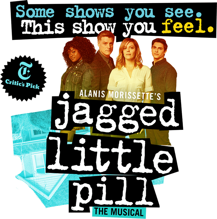
Just unveiled today on the official website and all social media platforms. Personally, I dislike the new emblem (black background, white text) and prefer the one used since they first announced their B'way transfer.
Also, the new homepage on their website markets Jagged even more so as Next to Normal 2.0 (house in the background), as if the show isn't a ripoff in the first place.
To say the least, I'm getting the impression that Jagged could very well have a future post-COVID if their PR team changed their look. My guess is they probably won't reopen in New York but will go out on a national tour 2022-23. But in the end, we won't know for months what the fate of most shows will be.
I like it much better than the artwork with the open hand. Did the artwork with the title on the palm of the hand have some sort of significance?
I don't know.
Here is the logo (which the OP should have included) for those interested:
Is this a show on Broadway or the CW?
Here's the logo without the corresponding promotion thus far:
Do they expect ticket buyers to know who those four people are? Is one of them supposed to be playing Alanis?
Jordan Levinson said: "To say the least, I'm getting the impression thatJaggedcould very well have a future post-COVID iftheir PR team changed their look. My guess isthey probably won't reopen in New Yorkbut will go out on a nationaltour2022-23. But in the end, we won't know for months what the fate of most shows will be."
Just an FYI that the advertising agency comes up with the key art and overall look and feel of the show, not the press team.
I don’t see this show reopening. If it somehow does, I don’t see it lasting long. I don’t see any of the shows lasting long. It’s all very sad and depressing.
The new art looks like a bad photoshop project.
bwaylyric said: "Do they expect ticket buyers to know who those four people are? Is one of them supposed to be playing Alanis?"
Nobody plays Alanis, she isn't a character.
Stand-by Joined: 12/15/15
unclevictor said: "I don’t see this show reopening. If it somehow does, I don’t see it lasting long. I don’t see any of the shows lasting long. It’s all very sad and depressing."
I actually thought this show may prosper when it reopens because it is very woke and social justice oriented.
Why put out new artwork when it's at least 6 months before reopening?
Mmmmm it’s a no from me. Looks like a community theatre’s logo 2 years after a show closed.
I think the show's return and its success might be aided by the virtual Tonys. Introduce new visuals, an energetic performance, and at least one Tony awards (Featured Actress, to me).
I never quite "got" the hand logo. This is better .
raddersons said: "I never quite "got" the hand logo. This is better ."
One of her most famous songs is “hand in my pocket.”
bwayphreak234 said: "The new art looks like a bad photoshop project."
At first glance, I thought it looked like the logo of a cliché comic strip.
It’s August Osage County turned upside down!
The new tagline certainly is evocative of the "this is a feel everything musical" Times review pull quote that Next to Normal used heavily in its advertising.
(Also: "this is a show you FEEL" What, do audience members get a book of different textured fabrics to brush along to the music? It's more like a tagline for a kid's museum than a musical)
Broadway Legend Joined: 2/10/11
I would expect there is a decent chance this would return, assuming some governmental subsidies are coming at some point (ain't coming from Trump, though). The question tho me is whether people will want see it. I have not seen it, but on this board a lot of people said it is very dark, somewhat depressing, dreary, none of which were comments on its quality.
Are enough people going to want to return to see something that some have voiced as being depressing?
Jarethan said: "I would expect there is a decent chance this would return, assuming some governmental subsidies are coming at some point (ain't coming from Trump, though). The question tho me is whether people will want see it. I have not seen it, but on this board a lot of people said it is very dark, somewhat depressing, dreary, none of which were comments on its quality.
Are enough people going to want to return to see something that some have voiced as being depressing?"
It’s not even that it’s depressing. It ends on a hopeful note for sure. It’s just a really terrible, melodramatic musical that is better suited for Lifetime.
MadonnaMusical said: "raddersons said: "I never quite "got" the hand logo. This is better ."
One of her most famous songs is “hand in my pocket.”"
Yeah but just because it's a song doesn't mean it's a good logo...
The album artwork for the original Broadway cast recording has been updated on digital platforms.
Videos