

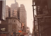
Todd Haimes marquee looks less than appealing
BorisTomashevsky
Broadway Legend Joined: 4/30/22
#1Todd Haimes marquee looks less than appealing
Posted: 2/1/24 at 6:36am
I know they’re bleeding money but is this really the best they could do? Looks like the latest poor intern to arrive was given the task of “design our new marquee!”
Marquees all around are looking less like elegant theatre names and more like hotel/bank/bar signs.
https://www.broadwayworld.com/article/Roundabouts-Home-on-Broadway-Officially-Renamed-the-Todd-Haimes-Theatre-20240131
OhHiii
Broadway Legend Joined: 4/30/16
#2Todd Haimes marquee looks less than appealing
Posted: 2/1/24 at 8:05am
This is a digital marquee, the same as has always been there for the American Airlines.
BorisTomashevsky
Broadway Legend Joined: 4/30/22
#3Todd Haimes marquee looks less than appealing
Posted: 2/1/24 at 8:24am
I could have worded that better. I meant the graphic design of Haimes’ name on the screen. Surely anything’s possible when pixels are involved.

#4Todd Haimes marquee looks less than appealing
Posted: 2/1/24 at 8:25am
Most of the marquees nowadays look less than appealing. I hate digital marquees so much. Let’s hope they don’t install one on the majestic.
RippedMan
Broadway Legend Joined: 8/14/05
#5Todd Haimes marquee looks less than appealing
Posted: 2/1/24 at 8:34am
Agreed. Especially looking at the West End and how appealing some of those are. I love that they went back to the original with like the Rogers, etc. Wish they'd go that route.
Broadway61004
Broadway Legend Joined: 4/14/11
#6Todd Haimes marquee looks less than appealing
Posted: 2/1/24 at 9:02am
I mean, it frankly looks a lot better than the American Airlines one did, which isn't saying much, but at least is progress, I guess?

#7Todd Haimes marquee looks less than appealing
Posted: 2/1/24 at 9:36am
I'm sure they will add a physical sign soon as they had to take down the American Airlines marquee first. People, please chill.

ErmengardeStopSniveling
Broadway Legend Joined: 9/20/18
#8Todd Haimes marquee looks less than appealing
Posted: 2/1/24 at 9:57am
Has the vertical "American Airlines Theatre" part been removed or is that just cropped out? I expect there'll be some kind of vertical eventually, too.

#9Todd Haimes marquee looks less than appealing
Posted: 2/4/24 at 11:39am
I'd like it better if the smaller digital signs weren't there, and they kept physical signage to match the vertical marquee. Really no matter what, it just looks way too busy.
"Hey little girls, look at all the men in shiny shirts and no wives!" - Jackie Hoffman, Xanadu, 19 Feb 2008

#10Todd Haimes marquee looks less than appealing
Posted: 2/4/24 at 12:22pm
I read (I think on TheaterMania but I can't really remember) that the marquee is a work in progress and not the final product.
Tom5
Broadway Star Joined: 9/23/11
#11Todd Haimes marquee looks less than appealing
Posted: 2/4/24 at 4:59pm
I think the marquee name as shown is good. It's simple and straightforward. If there are to be flourishes they should be reserved for the title of the show playing.
Videos