Worst Show Logo?
UrNotAMachine
Stand-by Joined: 2/17/15
#25Worst Show Logo?
Posted: 12/3/15 at 4:58pm
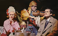
For what I thought was a brilliant revival, the 2006 production of Company had an absolutely hideous logo.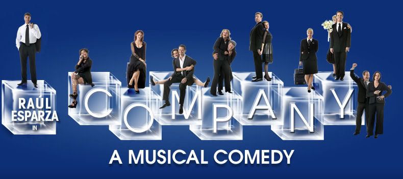
#26Worst Show Logo?
Posted: 12/3/15 at 5:09pm

#27Worst Show Logo?
Posted: 12/3/15 at 8:59pm
Not sure neo. As many times as I have seen it I never noticed that it said "A new musical". The new one looks like airbrush or something. I am amazed that the light has been out for this long. Second time.
neonlightsxo
Broadway Legend Joined: 7/29/08
#28Worst Show Logo?
Posted: 12/4/15 at 1:05pm
re: "new musical"
https://farm1.staticflickr.com/37/82723052_e23c665384_b.jpg
#29Worst Show Logo?
Posted: 12/4/15 at 11:53pm
I like the PHANTOM OF THE OPERA broken-glass text treatment... but the famous mask logo makes zero sense. Unless I've been mistaken all these years: does the Phantom ever wear a half-face mask that covers both eyes? How did that mask become a universally-recognized visual emblem of the show even though the phantom's one-sided face mask has become a universally-recognized costume piece?
#30Worst Show Logo?
Posted: 12/5/15 at 1:45am
One of the bonus features on the Phantom DVD has Hal Prince explaining that the artwork simply came before the costume design was finalized. Initially it was to be a mask like you see in the logo but Hal worried that the mask would be difficult for the actor to play behind and Maria redesigned it as a vertical half mask to be worn on the left side of the face and finally, for whatever reason, Michael Crawford requested to have the mask switched to his right side and that's the mask you see today. The logo just came first and was never changed.
#31Worst Show Logo?
Posted: 12/5/15 at 5:07pm
Yeah, I really don't like the new Wicked design at all; at the very least, they should've just edited out that "A New Musical" bit or, preferably for me, at the most switched it to the logo that they use for the West End/German productions, which is essentially the original logo only photographed instead of drawn: http://img0111.psstatic.com/163383249_wicked---die-hexen-von-oz-deutsche-version-weitere.jpg
I feel like the European logo looks a lot less...I dunno, cheap compared to the two Broadway ones.
Wilmingtom
Broadway Legend Joined: 7/18/11
#33Worst Show Logo?
Posted: 12/6/15 at 12:48am
I actually think that the minimalist 2-D Broadway WICKED poster is better than the "glossy" European one.
#34Worst Show Logo?
Posted: 12/6/15 at 1:08am
I was actually talking about the one on the 50the street side with the witches.
#35Worst Show Logo?
Posted: 12/6/15 at 3:42pm
Mr. Nowack said: "I actually think that the minimalist 2-D Broadway WICKED poster is better than the "glossy" European one."
To each his own! I just think the European one looks a lot prettier.
#36Worst Show Logo?
Posted: 12/6/15 at 4:02pm
Mr. Nowack said: "I actually think that the minimalist 2-D Broadway WICKED poster is better than the "glossy" European one."
AGREED, and no one else seems to understand me on this!!! I hate that they've transitioned all their marketing materials to the "glossy" one. Blech.
#37Worst Show Logo?
Posted: 12/6/15 at 4:58pm
I don't even really like Wicked but I think that original logo is brilliant. The shaded one is just not as stylish and sharp.
#38Worst Show Logo?
Posted: 12/6/15 at 5:38pm
I think this logo for wicked is just perfect. It's not as glossy as the European version and it's not the old version. It's I between.
Image from http://www.flickeringmyth.com/wp-content/uploads/2014/12/New-Wicked-Logo-5x5.jpg.
#39Worst Show Logo?
Posted: 12/6/15 at 6:12pm
call_me_jorge, is that the version currently on the playbill?
#40Worst Show Logo?
Posted: 12/6/15 at 7:17pm
Mr. Nowack said: "call_me_jorge, is that the version currently on the playbill?"
I think so.
#41Worst Show Logo?
Posted: 12/6/15 at 8:06pm
I hate the version of Wicked's poster where they look like real people. I much prefer the original Broadway logo.
#42Worst Show Logo?
Posted: 12/6/15 at 9:33pm
I do generally prefer unabashedly 2D poster art over pseudo-CGI three dimensional ones.
TerrenceIsTheMann
Broadway Star Joined: 9/28/15
#43Worst Show Logo?
Posted: 12/6/15 at 10:25pm
Personally, I think the worst logos on Broadway are Dames at Sea and The Gin Game.
Videos
