

LEAP OF FAITH artwork
RippedMan
Broadway Legend Joined: 8/14/05
#25LEAP OF FAITH artwork
Posted: 1/27/12 at 4:04pm
Even if that is a place holder, it's not something that is going to stir up any commotion or interest, which is the intent, I'd assume?
#26LEAP OF FAITH artwork
Posted: 1/27/12 at 5:11pmIt certainly needs more added; as a title font it's ok, but it's not a poster design
CurtainPullDowner
Broadway Legend Joined: 11/4/04
#27LEAP OF FAITH artwork
Posted: 1/27/12 at 5:12pm
Is this spose to resemble LuPone GYPSY?
No Raul "in" or "starring"?
#28LEAP OF FAITH artwork
Posted: 1/27/12 at 6:53pm
The website, I have too optimistically assume, has got to be an interim placeholder. But they'd probably be better off just to take it down and hurry up with a real website, now that tickets are on sale. What's up there now barely looks official.
The artwork they released today is a little dull, but perhaps once there are promotional images and it gets closer, there will be further incarnations? I'm not going to jump to the conclusion that this is final, since, yeah, it could use some jazzing up.
#29LEAP OF FAITH artwork
Posted: 1/27/12 at 6:54pmIs this a community theatre show? A community theatre show on Broadway?

#30LEAP OF FAITH artwork
Posted: 1/27/12 at 6:57pmI still have to vote Jesus Christ Superstar for worst graphic design so far this season. It doesn't match the tone of this production at all. The logo used in the Stratford commercial was far more appropriate.
wonkit
Broadway Legend Joined: 9/30/08
#31LEAP OF FAITH artwork
Posted: 1/27/12 at 7:35pm
If I recall the LA version correctly, the initial poster included a figure in a mirrored jacket, and once they had "real" production shots, they substituted Raul in the mirrored jacket. Let's hope (and pray?) that this is just something preliminary. The show deserves better than this.
(And I didn't like the COMPANY art work either.)
#32LEAP OF FAITH artwork
Posted: 1/27/12 at 8:34pm
Yes... the titling for the JCS revival is awful, however, I kinda fancy the leather background. But the logo... is bad 90s Kai Power Tools Photoshop filter.
Of course, between this new logo and the LA logo... it is a slight improvement. The LA one is a friggin eyesore. I have a feeling this is Serino Coyne.
"Are we being attacked or entertained?" - MST3K
My theatre poster/logo portfolio: http://www.listenterprises.com/
#33LEAP OF FAITH artwork
Posted: 1/27/12 at 8:34pm
Yes... the titling for the JCS revival is awful, however, I kinda fancy the leather background. But the logo... is bad 90s Kai Power Tools Photoshop filter.
Of course, between this new logo and the LA logo... it is a slight improvement. The LA one is a friggin eyesore. I have a feeling this is Serino Coyne.
"Are we being attacked or entertained?" - MST3K
My theatre poster/logo portfolio: http://www.listenterprises.com/
#34LEAP OF FAITH artwork
Posted: 1/28/12 at 1:07pmIt could be aka which has given us some of the worst artwork on Broadway - House of Blue Leaves anyone????????

#35LEAP OF FAITH artwork
Posted: 1/28/12 at 5:52pm
JCS is pretty bad, in no small part because it makes it look like Jesus Christ Super Star. The English major in me shudders. But it also looks cheap.
As cheap as LoF, to bring it all back.

#36LEAP OF FAITH artwork
Posted: 2/10/12 at 2:02pm

From the photoshoot video. Looks like this could well be the official logo.
Sarcasm is an allergic reaction to stupid people.

#37LEAP OF FAITH artwork
Posted: 2/10/12 at 3:14pmIt is very bad (the artwork and the website). Looking forward to the play though!

#39LEAP OF FAITH artwork
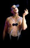
Posted: 2/11/12 at 12:47amThat jacket is just my favorite thing.
#40LEAP OF FAITH artwork
Posted: 2/11/12 at 1:28pmGeez, but how long does it take to update a website?! I went over to the official site and it makes me yearn for the black and white logo we were all complaining about.
wonkit
Broadway Legend Joined: 9/30/08
#41LEAP OF FAITH artwork
Posted: 2/13/12 at 6:40pmCheck it out - much improved, including a count-down clock!

#44LEAP OF FAITH artwork
Posted: 2/13/12 at 8:57pmIt looks a LOT like Sister Act's non-specific, blandly sparkly ad campaign.
Broadway Legend Joined: 12/31/69
#45LEAP OF FAITH artwork
Posted: 2/13/12 at 9:38pmI also thought Sister Act when I first saw it. Is it the same ad agency that does both shows?
#46LEAP OF FAITH artwork
Posted: 2/13/12 at 9:44pm
Between the stars in the background and prominently featuring "the jacket," it seems to me like they're paying homage to the poster for the original film.
http://www.movieposter.com/posters/archive/main/40/MPW-20193
Tonya Pinkins: Then we had a "Lot's Wife" last June that was my personal favorite. I'm still trying to get them to let me sing it at some performance where we get to sing an excerpt that's gone.
Tony Kushner: You can sing it at my funeral.
Updated On: 2/13/12 at 09:44 PM
Tony Kushner: You can sing it at my funeral.
#47LEAP OF FAITH artwork
Posted: 2/13/12 at 11:18pmThe composition of that image, and Steve Martin's face, make it sort of compelling. The tagline is evocative and tells us what the movie is about in a few simple words. It's a pretty decent movie poster. Nothing spectacular or iconic, but it clearly says what it is. The Broadway artwork uses the same basic imagery, but it tells us nothing. It tells us, "Here is another mildly sparkly Broadway show that you have no reason to see over something that your Aunt told you about. Why not see if Lion King or Wicked has a few tickets available?"
wonkit
Broadway Legend Joined: 9/30/08
#48LEAP OF FAITH artwork
Posted: 2/14/12 at 8:34am
So, you are completely ignoring the paragraph under the "sparkly image"? The fact that they have not decided on a tag line yet? That rehearsals are only just starting?
On the other hand, if you are not intrigued by Raul Esparza in leather pants and a mirrored jacket, maybe you should go see LION KING. This is not your mother's gospel choir.
RippedMan
Broadway Legend Joined: 8/14/05
#49LEAP OF FAITH artwork
Posted: 2/19/12 at 12:34pmI like it. They just posted pictures of the marquee. It looks pretty good. I'm intrigued.
Videos