

PLAYBILL Covers of the 2015-2016 Season
VintageSnarker
Broadway Legend Joined: 1/30/15
#100PLAYBILL Covers of the 2015-2016 Season
Posted: 12/17/15 at 4:12pm
Does LCT ever switch to black and white? After all the chatter here, I was pleased to see that King and I still has their full color Playbills.

GreasedLightning
Broadway Legend Joined: 2/11/14
#101PLAYBILL Covers of the 2015-2016 Season
Posted: 12/17/15 at 4:47pm
VintageSnarker said: "Does LCT ever switch to black and white? After all the chatter here, I was pleased to see that King and I still has their full color Playbills.
"
In recent memory the shows at the Beaumont that have gone black and white are War Horse and Ann, though I'm not exactly sure that those are really LCT Productions, per say. Correct me if I am wrong. Otherwise, as far back as I can remember (probably the early 2000s) most of their Playbills have remained in color throughout the entire run. Again, correct me if I'm wrong. While I am so glad that TKAI is still in color, they now have FIVE Playbill designs listed (including one Pride Playbill from this past June). Seems the only difference is that they keep changing the height of the columns. Strange that they keep changing it.
Looks like The Humans will receive another old-fashioned Playbill design and I love it!

#102PLAYBILL Covers of the 2015-2016 Season
Posted: 12/17/15 at 6:29pm
Whoa that HUMANS playbill is stunning.
Keeping BroadwayWorld Illustrated
GreasedLightning
Broadway Legend Joined: 2/11/14
#103PLAYBILL Covers of the 2015-2016 Season
Posted: 12/17/15 at 6:51pm
I agree. I love their new Broadway artwork and think that it would have looked good on a Playbill but I'll take this design because it is, indeed, awesome.

#104PLAYBILL Covers of the 2015-2016 Season
Posted: 12/17/15 at 9:58pm
GreasedLightning said: "I agree. I love their new Broadway artwork and think that it would have looked good on a Playbill but I'll take this design because it is, indeed, awesome. "
By "new Broadway artwork" do you mean the one that they use on their Broadway website with the shophouses lined up and the humans in differently sized letters above? Or do you mean the current Off-Broadway with the dark green background and the stairs? (I doubt that is what you mean though!)
I do agree - that Playbill is stunning. I love Classic Playbills so much, and I'm glad Scott Rudin seems to like them too. :)
GreasedLightning
Broadway Legend Joined: 2/11/14
#105PLAYBILL Covers of the 2015-2016 Season
Posted: 12/17/15 at 10:21pm
The one with the shops lined up and new lettering above, chrysanthemumtea!
#106PLAYBILL Covers of the 2015-2016 Season
Posted: 12/18/15 at 7:48am
Then I agree - I haven't seen the play so I can't comment whether it fits the feeling of the play - but I'm not going to complain about a new Classic playbill!
And, Our Mother's Brief Affair has a playbill!

@z5
Broadway Legend Joined: 11/30/15
#107PLAYBILL Covers of the 2015-2016 Season
Posted: 1/7/16 at 11:17pm
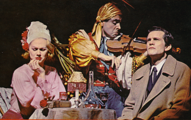
Fiddler on the Roof cover now also black and white..
@z5
Broadway Legend Joined: 11/30/15
#108PLAYBILL Covers of the 2015-2016 Season
Posted: 1/7/16 at 11:20pm
Disaster! Playbill is uploaded!
16.jpghttp://www.playbillvault.com/Show/Detail/Cover/14149/67451/Disaster

#109PLAYBILL Covers of the 2015-2016 Season
Posted: 1/8/16 at 12:18am
@z5 said: "Fiddler on the Roof cover now also black and white.."
It's increasingly feeling like you need to see a show in previews if you're a fan of colorful Playbill covers!
#110PLAYBILL Covers of the 2015-2016 Season
Posted: 1/8/16 at 12:57am
For people who don't feel like going to playbillvault!

Disaster! looks great in colour - I only hope it stays that way.

Fiddler doesn't fare well from Black & White as others like The Color Purple - though I don't see why they've gone B/W as they've been doing well so far, maybe they're lowering costs in order to get through the winter? I do wish more shows would do what Fun Home did and at least try to make their playbills look good in B/W.
"It's increasingly feeling like you need to see a show in previews if you're a fan of colorful Playbill covers!"
BroadwayGuy12, I couldn't be sadder that this seems to be true. Though Fiddler's B/W is only starting in Feb.
SushJoya
Swing Joined: 7/28/15
#111PLAYBILL Covers of the 2015-2016 Season
Posted: 1/8/16 at 12:58pm
So Fiddler is keeping the colored playbill for the rest of January? Hope so, was planning to see it later this month!
VotePeron
Broadway Legend Joined: 5/2/13
#112PLAYBILL Covers of the 2015-2016 Season
Posted: 1/8/16 at 1:00pm
 Something Rotten has gone B/W. Looks pretty good.

#113PLAYBILL Covers of the 2015-2016 Season
Posted: 1/8/16 at 1:04pm
I'm really not crazy about the Fiddler playbill cover. I love the font, but the layout is kinda strange. The guy looks like he was just plopped on there, with no sense of how we would work in the space. I have the something rotten color, which is pretty awesome, as is most Peter DeSeve's artwork. But at least they reworked it for the black and white playbill
@z5
Broadway Legend Joined: 11/30/15
#114PLAYBILL Covers of the 2015-2016 Season
Posted: 1/15/16 at 1:09pm
Eclipsed, Blackbird, and Hughie all have Playbill covers!

loliveve
Broadway Legend Joined: 6/24/12
#115PLAYBILL Covers of the 2015-2016 Season
Posted: 1/15/16 at 1:20pm
Eclipsed:

loliveve
Broadway Legend Joined: 6/24/12
#116PLAYBILL Covers of the 2015-2016 Season
Posted: 1/15/16 at 1:21pm
Blackbird:

loliveve
Broadway Legend Joined: 6/24/12
#117PLAYBILL Covers of the 2015-2016 Season
Posted: 1/15/16 at 1:21pm

@z5
Broadway Legend Joined: 11/30/15
#118PLAYBILL Covers of the 2015-2016 Season
Posted: 1/15/16 at 1:25pm
Bright Star also has one. But I have no interest in that show.
#119PLAYBILL Covers of the 2015-2016 Season
Posted: 1/15/16 at 1:50pm
Another sharp "vintage" style Playbill!
Keeping BroadwayWorld Illustrated

#120PLAYBILL Covers of the 2015-2016 Season
Posted: 1/15/16 at 2:27pm

Nothing matters but knowing nothing matters. ~ Wicked
Everything in life is only for now. ~ Avenue Q
There is no future, there is no past. I live this moment as my last. ~ Rent
"He's a tramp, but I love him."
Updated On: 1/15/16 at 02:27 PM
Everything in life is only for now. ~ Avenue Q
There is no future, there is no past. I live this moment as my last. ~ Rent

jacobsnchz14
Broadway Legend Joined: 12/13/06
#121PLAYBILL Covers of the 2015-2016 Season
Posted: 1/15/16 at 3:25pm
I love BRIGHT STAR's artwork...

#122PLAYBILL Covers of the 2015-2016 Season
Posted: 1/15/16 at 3:31pm
I really love both Blackbird and Bright Star Playbill designs. I wonder how Bright Star will look in B&W, though?
BroadwayConcierge
Broadway Legend Joined: 7/24/15
#123PLAYBILL Covers of the 2015-2016 Season
Posted: 1/15/16 at 11:27pm
Still don't understand why Bright Star's artwork displays a woman proudly presenting her breasts to a passing train.
VintageSnarker
Broadway Legend Joined: 1/30/15
#124PLAYBILL Covers of the 2015-2016 Season
Posted: 1/16/16 at 5:42pm
I like the Disaster! Playbill. The disco ball in the lifesaver makes sense even if it looks a bit odd.
I don't think the actors are particularly great on the Blackbird cover. It looks like a generic Vogue photospread. But the overall vibe works. Is this a new thing for plays now... going back to the older cover style?
I don't know what the Bright Star cover means yet (not having seen the show) but I love the background color and the text pops in an appealing way.