Retro Playbills - Scott Rudin/What do you think?
#1Retro Playbills - Scott Rudin/What do you think?
Posted: 2/21/16 at 12:22pm
Forgive me if there has been a thread about this. I couldn't find one, but we know how the search function can be :P
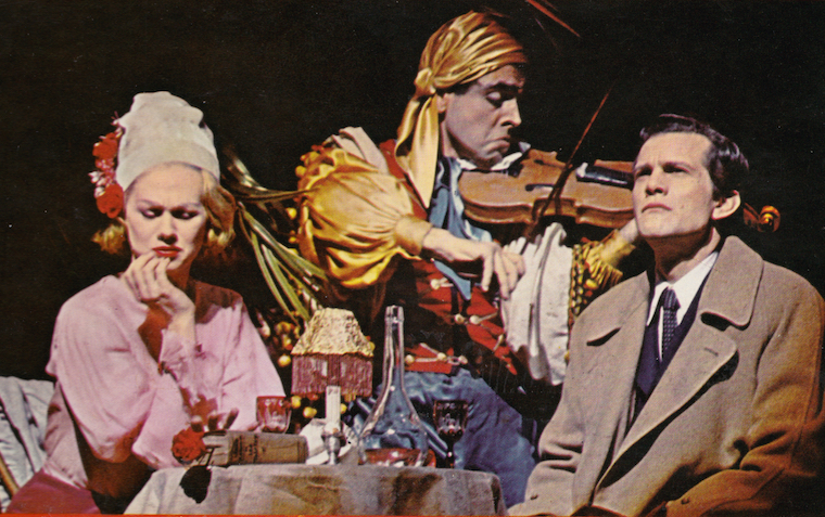
After seeing Blackbird last night and seeing that they were using the retro Playbill design like some other shows have been, I noticed that all the recent shows to do it were produced by Scott Rudin. Is he the one behind it? Skylight, A View From the Bridge, The Humans, Blackbird, The Crucible. It's looking like this might be something we can come to consistently expect from his productions.
What do you think of them? I thought they were cool and classy at first, but I realized I missed having a Playbill with the show's actual design on it. It's not that I'm super broken up about it, but I feel like using the same design concept for multiple productions takes away some of the individuality of each Playbill. I realize of course that they used to use a design very similar to this back in the day, but to be quite honest I'm kind of glad they gave that up.
#3Retro Playbills - Scott Rudin/What do you think?
Posted: 2/21/16 at 12:32pm
I quite like the retro-style Playbills- particularly as we have moved into an age in which plays do not have very distinctive logos themselves and rely heavily on photos of the cast anyway.
#4Retro Playbills - Scott Rudin/What do you think?
Posted: 2/21/16 at 1:07pm
I personally love them and am glad to see that it wasn't a one-off idea for Skylight -- that was the first show from Rudin that used the vintage Playbill, right? They are also particularly effective because they've been used appropriately based on the production (i.e. it wouldn't have made sense for Fish in the Dark, also a Rubin production, to use a vintage Playbill) but they are really working well for these revivals and even in the beautifully minimalistic design for The Humans.
#5Retro Playbills - Scott Rudin/What do you think?
Posted: 2/21/16 at 1:14pm
It looks gorgeous with the Shuffle Along artwork.

#6Retro Playbills - Scott Rudin/What do you think?
Posted: 2/21/16 at 1:47pm
I think they look fantastic and much more successful, as far as design goes.
Updated On: 2/21/16 at 01:47 PM
WhatDoINeedWithLove?2
Swing Joined: 5/5/11
#7Retro Playbills - Scott Rudin/What do you think?
Posted: 2/21/16 at 2:52pm
I love them - especially Shuffle Along. I hope it never switches to b&w. They are the same dimensions as standard Playbills, right?
#9Retro Playbills - Scott Rudin/What do you think?
Posted: 2/21/16 at 7:16pm
I quite like them, they tend to be much more aesthetically pleasing to me than the show logo designs. I love the View From the Bridge one.
#10Retro Playbills - Scott Rudin/What do you think?
Posted: 2/21/16 at 7:19pm
I cherish my VIEW FROM THE BRIDGE Playbill.
#11Retro Playbills - Scott Rudin/What do you think?
Posted: 2/21/16 at 7:21pm
Ooh! I love Shuffle Along! That's my favorite of the ones I've seen so far.
Like I said, my issue with them is less about the way they look, and more about how it feels incongruous with the rest of the show's design. Plus I tend to prefer Playbills that are in color.
#12Retro Playbills - Scott Rudin/What do you think?
Posted: 3/21/16 at 3:48pm
I stand by critiques of this recent trend, but I admit this is kinda cool. Someone on Tumblr made a bunch of mock-designs for if other shows had this style of Playbill
http://jaketheescapologist.tumblr.com/post/141397955577/if-all-playbills-were-vintage-styled
JM226
Broadway Star Joined: 11/10/15
#13Retro Playbills - Scott Rudin/What do you think?
Posted: 3/21/16 at 4:00pm
people. there is no major difference of design or specs or anything of that sort. they just print the playbills without bleed now, which is significantly cheaper but creates that white border you see around the edges. that's not a result of a design. it's the result of cheaper printing. if they printing all of their playbills WITH bleed for Scott Rudin productions, he must have made some special arrangement with them or he's actually paying the cost difference but would he REALLY do that? that cost difference is potentially thousands and thousands of dollars...
VintageSnarker
Broadway Legend Joined: 1/30/15
#14Retro Playbills - Scott Rudin/What do you think?
Posted: 3/21/16 at 4:07pm
I think you've got to pair the right show with this design/style, especially taking the black and white into account. Of the ones of that link, JBroadway, I think the Chicago one fits the best. Some of the other ones are too somber. I think the style works a little better for plays than for musicals.
#15Retro Playbills - Scott Rudin/What do you think?
Posted: 3/21/16 at 4:16pm
JM226 said: "would he REALLY do that? "
I'm confused as to what point you're trying to make. Which aspect of this situation are you trying to call into question?
JM226
Broadway Star Joined: 11/10/15
#16Retro Playbills - Scott Rudin/What do you think?
Posted: 3/21/16 at 4:38pm
would he really cover the cost difference just to have playbills printed with bleed? that is thousands and thousandsa of dollars
#17Retro Playbills - Scott Rudin/What do you think?
Posted: 3/21/16 at 5:04pm
Well, I admit I have a pretty limited knowledge of how printing costs work, as well as how much power Rudin has in the producing process. The money may not be coming out of his own pocket, it may just be included as part of the show's budget, and the various producers and investors are jointly paying for it along with the rest of the show.
But regardless of where the money is coming from or what sort of arrangement he's made, the fact remains that these Playbills ARE being printed in this style, and the common thread would appear to be Rudin. It probably is Rudin who is making this decision.
#18Retro Playbills - Scott Rudin/What do you think?
Posted: 3/21/16 at 5:37pm
I have one from THE FLICK. Love it. Sadly the SHUFFLE ALONG ones are gone.
@z5
Broadway Legend Joined: 11/30/15
#19Retro Playbills - Scott Rudin/What do you think?
Posted: 3/21/16 at 10:08pm
The second version of Blackbird ones are really excellent and capture that particular scene perfectly.
#21Retro Playbills - Scott Rudin/What do you think?
Posted: 3/21/16 at 11:02pm
JM226 said: "people. there is no major difference of design or specs or anything of that sort. they just print the playbills without bleed now, which is significantly cheaper but creates that white border you see around the edges. that's not a result of a design. it's the result of cheaper printing. if they printing all of their playbills WITH bleed for Scott Rudin productions, he must have made some special arrangement with them or he's actually paying the cost difference but would he REALLY do that? that cost difference is potentially thousands and thousands of dollars...
"
You're completely wrong. These Playbills are being done in a completely stylized way on purpose and it is absolutely a redesign of the Playbills we have come to know and love in the past 15-20 years.
Bleed or no bleed, this is a design choice and you're wrong if you think otherwise.
#22Retro Playbills - Scott Rudin/What do you think?
Posted: 3/21/16 at 11:04pm
uncageg said: "I have one from THE FLICK. Love it. Sadly the SHUFFLE ALONG ones are gone.
"
They're not gone yet. The Playbill cover for Shuffle Along will remain the same until the month of April.
Playbills do not change their cover overnight. It is a monthly cycle.
@z5
Broadway Legend Joined: 11/30/15
#23Retro Playbills - Scott Rudin/What do you think?
Posted: 3/21/16 at 11:04pm
...The Crucible is at the Walter Kerr...a Jujamcyn theatre, so apparently they don't refuse to work him.
#24Retro Playbills - Scott Rudin/What do you think?
Posted: 3/21/16 at 11:06pm
PThespian said: "Rudin is the David Merrick of our time. He is extremely rude and demeaning towards the people on his productions (he once got an usher kicked out of a house for telling a patron the show was 2:45 when it was 3:00). I heard that is one reason his shows don't go to Jujamcyn theaters. They refuse to work with him"
I don't think Jujamcyn is that unwilling to work with Rudin- he currently has two productions playing in their theatres- The Book of Mormon and The Crucible. I'm not saying the other stuff isn't true, but that's definitely not.
#26Retro Playbills - Scott Rudin/What do you think?
Posted: 3/22/16 at 12:47am

Love love love this one.
#27Retro Playbills - Scott Rudin/What do you think?
Posted: 3/22/16 at 12:54am
GreasedLightning said: "uncageg said: "I have one from THE FLICK. Love it. Sadly the SHUFFLE ALONG ones are gone.
"
They're not gone yet. The Playbill cover for Shuffle Along will remain the same until the month of April.
Playbills do not change their cover overnight. It is a monthly cycle. "
I am well aware that it is a monthly cycle. I also know that if a production needs a change made, it is made and the remaining Playbills they don't want used go away. It may not be overnight, but it can happen within the month. I have seen it happen.
Videos


