Anyone notice how BLUE Broadway is these days?
#1Anyone notice how BLUE Broadway is these days?
Posted: 8/30/18 at 9:04pm
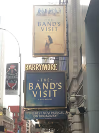
I've been in the theatre district a lot recently (as people on this board often do), and as I look around at the marquees, I've noticed that a TON of current Broadway shows prominently feature the color blue in their art design. I count the following:
American Son, Band's Visit, Carousel (to a lesser extent), Come From Away, Dear Evan Hansen, Frozen, My Fair Lady, Once on this Island, Phantom of the Opera, Spongebob, Summer, and Waitress. Plus a few more use mostly purple (Aladdin, Anastasia).
Any theories as to why? Maybe it's subconscious Democrat pride ![]()
Kimberly_E
Swing Joined: 9/13/17
#2Anyone notice how BLUE Broadway is these days?
Posted: 8/30/18 at 9:15pm
I love your question, and it made me really curious so I did a little research, and this is what I found:
"Blue is often associated with sadness in the English language. Blue is also used extensively to represent calmness and responsibility. Light blues can be refreshing and friendly. Dark blues are more strong and reliable. Blue is also associated with peace and has spiritual and religious connotations in many cultures and traditions (for example, the Virgin Mary is generally depicted wearing blue robes).
The meaning of blue is widely affected depending on the exact shade and hue. In design, the exact shade of blue you select will have a huge impact on how your designs are perceived. Light blues are often relaxed and calming. Bright blues can be energizing and refreshing. Dark blues, like navy, are excellent for corporate sites or designs where strength and reliability are important." (Smashing Magazine)
I'm not sure how this could appeal to all the shows. Carousel's artwork is dark blue, so maybe the artist was trying to convey the strength and reliability of a classic musical with an incredible cast? Just a thought...
Also blue is supposed to be calming, so maybe the artists are trying to provide a calm space right next to Times Square ![]()
#3Anyone notice how BLUE Broadway is these days?
Posted: 8/30/18 at 9:16pm
It pops against the orange-ish tone of most human skin. Common marketing technique.
https://tvtropes.org/pmwiki/pmwiki.php/Main/OrangeBlueContrast
Everything in life is only for now. ~ Avenue Q
There is no future, there is no past. I live this moment as my last. ~ Rent
#4Anyone notice how BLUE Broadway is these days?
Posted: 8/30/18 at 11:20pm
As someone who sits next to art directors as they develop the art for these shows...I wish I had an answer. LOL
I've been interested in the fact that American Son's neon lighting style is the same as Angels in America.
#5Anyone notice how BLUE Broadway is these days?
Posted: 8/30/18 at 11:35pm
veronicamae said: "As someone who sits next to art directors as they develop the art for these shows...I wish I had an answer. LOL
I've been interested in the fact that American Son's neon lighting style is the same as Angels in America."
Gonna take a wild guess here and say that the lights in American Son’s logo are supposed to be the red and blue lights on top of a cop car.
(They are.)
#6Anyone notice how BLUE Broadway is these days?
Posted: 8/30/18 at 11:44pm
aasjb4ever said: "veronicamae said: "As someone who sits next to art directors as they develop the art for these shows...I wish I had an answer. LOL
I've been interested in the fact that American Son's neon lighting style is the same as Angels in America."
Gonna take a wild guess here and say that the lights in American Son’s logo are supposed to be the red and blue lights on top of a cop car.
(They are.)"
Ah, see I know absolutely nothing about that show - that makes sense. But I won't be able to unsee the Angels style!
#7Anyone notice how BLUE Broadway is these days?
Posted: 8/31/18 at 8:28am
The Phantom marquee was originally black; it changed to blue relatively recently, around the occasion of the 25th anniversary celebration. The blue design was unveiled first in London, with the "The Brilliant Original" descriptor.
"Michael Riedel...The Perez Hilton of the New York Theatre scene"
- Craig Hepworth, What's On Stage
Dallas Theatre Fan
Stand-by Joined: 3/10/13
#9Anyone notice how BLUE Broadway is these days?
Posted: 8/31/18 at 11:28am
I'm going to go conspiracy theory here: Blue is a cool color which would make people mind's subconsciously become calm. If the person feels calm when they see the poster they might be more inclined to buy a ticket and talk about the show.
This comes from the two classes of psychology I took in college ten years ago so, I might be all wrong.
#10Anyone notice how BLUE Broadway is these days?
Posted: 8/31/18 at 11:39am
I expected this thread to be about politics and themes of shows - blue vs red.
Ha!
Glad it was about the signage.
#11Anyone notice how BLUE Broadway is these days?
Posted: 8/31/18 at 11:45am
I'm not saying that this is a reason, but blue is BY FAR most people's favorite color, both male and female:
https://medium.com/the-peruser/why-most-peoples-favorite-color-is-blue-bd84fc4e4dfb
SharksVsJets
Stand-by Joined: 4/22/17
#12Anyone notice how BLUE Broadway is these days?
Posted: 8/31/18 at 11:49am
rayoflight104 said: "I expected this thread to be about politics and themes of shows - blue vs red.
Ha!
Glad it was about the signage. "
And I thought it was going to be about all the f*cking pottymouth language in shows.
#13Anyone notice how BLUE Broadway is these days?
Posted: 8/31/18 at 12:32pm
Over the past two trips to Broadway I managed to get quite a few marquee pictures, adding in a couple of new ones from the trip two weeks ago. I can kick myself for not getting some of the brand new ones like The Cher Show, Pretty Woman, King Kong, etc.
https://www.flickr.com/photos/57377062@N04/albums/72157667630832067
#14Anyone notice how BLUE Broadway is these days?
Posted: 8/31/18 at 1:27pm
Then there's the red/white/black invasion: Hello, Dolly, Gettin' the Band Back Together, Pretty Woman, Chicago, and School of Rock...
#15Anyone notice how BLUE Broadway is these days?
Posted: 8/31/18 at 3:48pm
Thanks for the theories, everyone!
@Yero My Hero, I didn't know about that trope in advertising! Definitely an interesting fact. However, most of the examples don't have any people on them, and two of them (OOTI and Summer) have people with darker skin tones.
jkstheatrescene said: "Then there's the red/white/black invasion: Hello, Dolly, Gettin' the Band Back Together, Pretty Woman, Chicago, and School of Rock..."
Never noticed that, but you're absolutely right! And while we're on the subject of color schemes, how about the fact that Hamilton, Harry Potter, and The Lion King -- three of the hottest shows on Broadway -- both have yellow backdrops? But then again so does Head Over Heels, so...
Videos
