

Posters: The Fine Art of Selling Broadway

Lovinbroadway2
Stand-by Joined: 11/1/14

Lovinbroadway2
Stand-by Joined: 11/1/14

#27Posters: The Fine Art of Selling Broadway
Posted: 1/3/15 at 8:58am
Same as Fantod I think the "Dear World" window card is among the best window cards of all time. The original Winter Garden "Follies" is my top pick followed by Marvin's "Prettybelle", Hilary Knight's "Colette", the "110 in the Shade" posted on this thread, Paul Davis' "The Cherry Orchard", Tony Walton's "Chicago" and many James McMullans.
To answer Fantod's question - I have been collecting James McMullan window cards for years. I think I have pretty much all of them, and as you can see I use his artwork as my avatar. To my knowledge he did not do an "Our Town" window card. The Lincoln Center window card I've seen is a photo of the Earth.
Updated On: 1/3/15 at 08:58 AM

#28Posters: The Fine Art of Selling Broadway
Posted: 1/3/15 at 11:51am
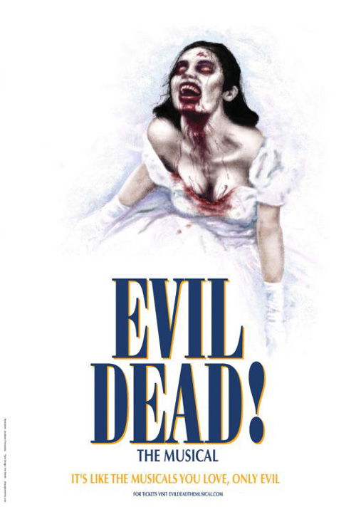
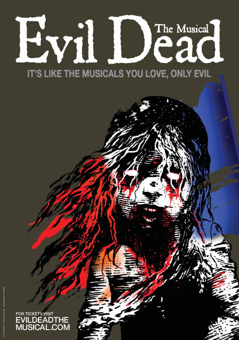
The posters from the Toronto production Evil Dead take the cake.
<
<
<
"I seem to have wandered into the BRAIN load-out thread... "
-best12bars
"Sorry I am a Theatre major not a English Major"
-skibumb5290
-best12bars
"Sorry I am a Theatre major not a English Major"
-skibumb5290

#29Posters: The Fine Art of Selling Broadway
Posted: 1/3/15 at 12:10pm
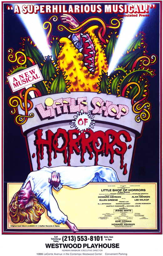
I love the 80s pop-art sensibility of the original Little Shop of Horrors:
The stylized homage to classic noir of City of Angels:

The all time classic Follies be Byrd:

....but the world goes 'round
#30Posters: The Fine Art of Selling Broadway
Posted: 1/3/15 at 12:14pm
And I've always loved the original La Cage Aux Folles:

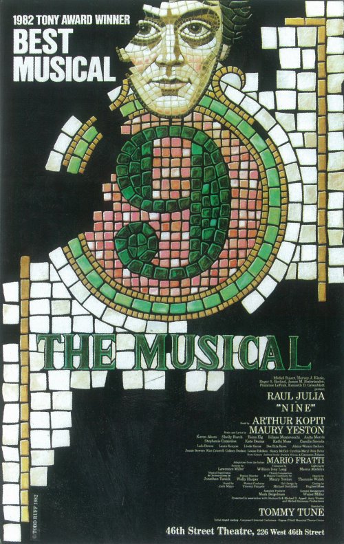
As well as the original Nine:
....but the world goes 'round
#31Posters: The Fine Art of Selling Broadway
Posted: 1/3/15 at 1:21pm
I love the artwork for the upcoming revival of The King and I.

"There’s nothing quite like the power and the passion of Broadway music. "
RippedMan
Broadway Legend Joined: 8/14/05
#32Posters: The Fine Art of Selling Broadway
Posted: 1/3/15 at 2:35pmThose Evil Dead posters are genius!
Broadway Legend Joined: 12/31/69
#33Posters: The Fine Art of Selling Broadway
Posted: 1/3/15 at 3:08pm

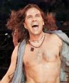
The NPH Hedwig poster is wonderful, but the greatest Broadway image ever
Broadway Legend Joined: 12/31/69
#34Posters: The Fine Art of Selling Broadway
Posted: 1/3/15 at 3:10pm
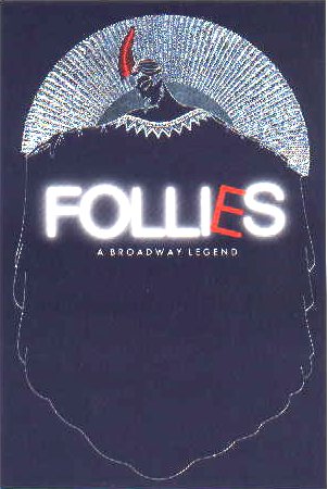
And an online photo does it no justice but this London Follies is another favorite
#35Posters: The Fine Art of Selling Broadway
Posted: 1/3/15 at 4:16pm
For those who really fascinated about the art of designing a broadway poster check out Frank "Fraver" Verlizzo's site. This man is broadway. He has designed the infamous sweeney todd art, lion king, sunday in the park with george, and many more. His stories around each piece are pretty terrific as well.
www.fraver.com
I will most definitely be writing him.
Fantod
Broadway Legend Joined: 10/3/14
#36Posters: The Fine Art of Selling Broadway
Posted: 1/3/15 at 4:27pmI like a lot of his work, but it's strange that he considers Sunday his favorite poster when I consider it one of the ugliest ever made. Something about the font with the sickly orange background makes the artwork seem just awful.

#37Posters: The Fine Art of Selling Broadway
Posted: 1/3/15 at 5:08pm
The On the Twentieth Century artwork is even more impressive in person. It's truly a work of art that could pass as being genuinely from the 20s. Art deco is easily imitated or evoked but rarely ever truly replicated like that.
"...everyone finally shut up, and the audience could enjoy the beginning of the Anatevka Pogram in peace."
Updated On: 1/3/15 at 05:08 PM

#38Posters: The Fine Art of Selling Broadway
Posted: 1/3/15 at 6:44pm
_poster.jpg)
The Broadway Grey Gardens artwork is one of my favorite recent ones.
#39Posters: The Fine Art of Selling Broadway
Posted: 1/3/15 at 6:59pm
Agree about On the Twentieth Century.
I also love the GG poster perfectlymarvelous.


....but the world goes 'round
#40Posters: The Fine Art of Selling Broadway
Posted: 1/3/15 at 9:54pm
"Anything you do, let it it come from you--then it will be new."
Sunday in the Park with George
#41Posters: The Fine Art of Selling Broadway
Posted: 1/3/15 at 10:00pm
The Broadway Grey Gardens artwork is one of my favorite recent ones.
---
One of my favorites as well
"Anything you do, let it it come from you--then it will be new."
Sunday in the Park with George

#42Posters: The Fine Art of Selling Broadway
Posted: 1/4/15 at 12:17am
Not Broadway but one of my all-time favorite posters.

#43Posters: The Fine Art of Selling Broadway
Posted: 1/5/15 at 6:06pmSort of related, does anyone know where I could buy a poster for a show that closed long ago? I'd like a Light in the Piazza poster, but all I could find (on eBay) were a couple of signed ones, which I don't care about. The Playbill store doesn't carry it anymore.
"Mr Sondheim, look: I made a hat, where there never was a hat, it's a Latin hat at that!"
Featured Actor Joined: 12/31/69
#45Posters: The Fine Art of Selling Broadway
Posted: 1/5/15 at 6:18pmThanks JoeKv99!! Found it there! :)
"Mr Sondheim, look: I made a hat, where there never was a hat, it's a Latin hat at that!"
#46Posters: The Fine Art of Selling Broadway
Posted: 1/9/15 at 8:13pm
I enjoyed this NY Times article as well. I thought the YENTL poster was super. Looking through postings here, I have to admit I had forgotten about the APPLE TREE colors (that orig. cast album & the talent that was Barbara Harris holds a special place in my heart) & I loved being reminded of CAVALIA which I schlepped out to Jersey to see & found so special! If I was slick enough I would add the DANCIN' Poster which had been a fav. of mine when young.
What I took away from the TIMES article most was how terrific it is that small theatres all around the country are equipped with either staff artists or are willing to hire a free-lancer to created a unique vision of their productions - not just replicate/copy the Broadway versions.
VIOLET was a show that I didn't think nailed the poster all that well & was surprised to find so many better versions (IMHO) from other productions. What a great testament to utilizing local artists & creating the possibility of improving upon original visions.
Updated On: 1/9/15 at 08:13 PM
#47Posters: The Fine Art of Selling Broadway
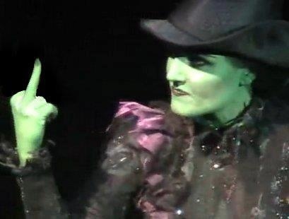
Posted: 1/9/15 at 8:19pm
I always liked the creepiness of this poster, even if the show itself was questionable. (I wish it wasn't showing up so big, sorry about that!)
"Was uns befreit, das muss stärker sein als wir es sind." -Tanz der Vampire
Updated On: 1/9/15 at 08:19 PM