

PLAYBILL Covers of the 2015-2016 Season

loliveve
Broadway Legend Joined: 6/24/12
#50PLAYBILL Covers of the 2015-2016 Season
Posted: 9/14/15 at 8:27pm

loliveve
Broadway Legend Joined: 6/24/12
#51PLAYBILL Covers of the 2015-2016 Season
Posted: 9/14/15 at 8:29pm
A View from the Bridge

loliveve
Broadway Legend Joined: 6/24/12
#52PLAYBILL Covers of the 2015-2016 Season
Posted: 9/14/15 at 8:29pm

#53PLAYBILL Covers of the 2015-2016 Season
Posted: 9/14/15 at 9:11pm
Interesting to see another Playbill this season emulate the vintage '60s style Playbills. Anyone have any connection between the two shows other than being British transfers?
Keeping BroadwayWorld Illustrated
Fantod
Broadway Legend Joined: 10/3/14
#54PLAYBILL Covers of the 2015-2016 Season
Posted: 9/14/15 at 9:16pm
^ The Barrow Street run of The Flick also used the old style of Playbill

Smaxie
Broadway Legend Joined: 9/26/05
#55PLAYBILL Covers of the 2015-2016 Season
Posted: 9/14/15 at 9:16pm
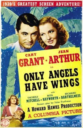
Dames at Sea is copying the artwork for the original movie poster for 42nd Street.
Begin at the beginning and go on till you come to the end: then stop.
VintageSnarker
Broadway Legend Joined: 1/30/15
#56PLAYBILL Covers of the 2015-2016 Season
Posted: 9/14/15 at 9:17pm
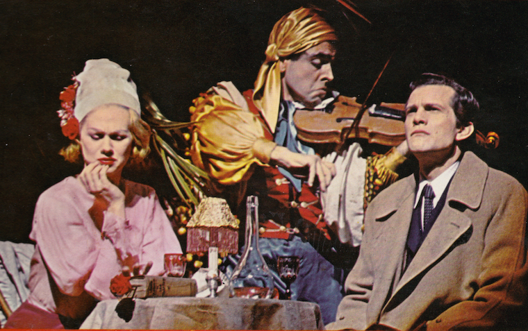
Therese Raquin: It might make sense given the content of the play but does anyone else think it's weird that Gabriel Ebert is the only one not looking at the camera for the photo? Also, the other wavy lines sort of follow the curves of the actors faces but the one dividing Keira and Gabriel just creates this odd negative space. Again, it might make sense with the play but it's offputting to the eye. Aside from that, I'm OK with it. It's not iconic or anything but it shows off the actors in a vaguely interesting way.
On Your Feet: Meh

GreasedLightning
Broadway Legend Joined: 2/11/14
#57PLAYBILL Covers of the 2015-2016 Season
Posted: 9/19/15 at 9:58am


Updated On: 9/19/15 at 09:58 AM
GreasedLightning
Broadway Legend Joined: 2/11/14
#58PLAYBILL Covers of the 2015-2016 Season
Posted: 9/19/15 at 9:59amUpdated On: 9/19/15 at 09:59 AM
WhatDoINeedWithLove?2
Swing Joined: 5/5/11


jbm2
Broadway Star Joined: 3/26/11
#61PLAYBILL Covers of the 2015-2016 Season
Posted: 10/11/15 at 3:26pm
Why do some Off Broadway theaters use playbills? And some not?
What determines this?

#62PLAYBILL Covers of the 2015-2016 Season
Posted: 10/11/15 at 3:48pm
Correct me if I'm wrong, but I always thought that it's up to the theatre itself. It costs a lot more money to use Playbill brand programs than another brand, or your own print-outs. So it just depends on whether the theatre wants it or not. I remember being surprised when I got a Playbill-brand program from Theatre For a New Audience, an off-off broadway theatre, but I guess they just had the funds to do it.
VintageSnarker
Broadway Legend Joined: 1/30/15
#63PLAYBILL Covers of the 2015-2016 Season
Posted: 10/11/15 at 3:48pm
I like the Playbills for King Charles III and Allegiance. I hope they keep them in color. While I have no interest in School of Rock, it's also a good design.
#64PLAYBILL Covers of the 2015-2016 Season
Posted: 10/11/15 at 3:51pm

I'm re-posting Dames at Sea because they changed the hair-colors of the girls (to more accurately show the color of their respective wigs in the show). I think the original Playbill design showed the actresses with their real-life hair colors.
Updated On: 10/11/15 at 03:51 PM
VintageSnarker
Broadway Legend Joined: 1/30/15
#65PLAYBILL Covers of the 2015-2016 Season
Posted: 10/11/15 at 4:31pm
Re: Dames at Sea
I still don't like the little trapezoid skirt shapes or understand why you would position Eloise there with a halo behind her head. But looking at the 42nd St poster I think some of the reasons why the legs are offputting are the shading and the way they're turned out. The legs in the 42nd St poster are facing forward. The legs in the Dames at Sea poster are facing away from the viewer at what feels like an awkward angle to be standing at in heels.


#67PLAYBILL Covers of the 2015-2016 Season
Posted: 10/27/15 at 3:51pm
^ YIKES! That was fast. SYLVIA is LITERALLY opening TONIGHT. Why the B&W?
BroadwayConcierge
Broadway Legend Joined: 7/24/15
#68PLAYBILL Covers of the 2015-2016 Season
Posted: 10/27/15 at 4:13pm
Ugh. B&W playbills depress me so.
#69PLAYBILL Covers of the 2015-2016 Season
Posted: 10/27/15 at 11:11pm
I wonder why shows don't opt for a title treatment over the fully illustrated covers when they go black and white. It would look a lot cleaner.
Keeping BroadwayWorld Illustrated
Theatre dweeb
Chorus Member Joined: 10/3/15
#70PLAYBILL Covers of the 2015-2016 Season
Posted: 10/27/15 at 11:33pm
This maybe a stupid question, but why is it a showbill for Aladdin instead of a playbill?

#71PLAYBILL Covers of the 2015-2016 Season
Posted: 10/28/15 at 12:04am
Showbill is playbills version of playbill for Disney and anyone who is willing to pay extra. Basically it give the show the freedom to omit or add certain advertisements. And since Disney has a lot of kids going to see the show it wouldn't look good having an ad for alcohol. Also it's only used at the new Amsterdam as I'm aware.
In our millions, in our billions, we are most powerful when we stand together. TW4C unwaveringly joins the worldwide masses, for we know our liberation is inseparably bound.
Signed,
Theater Workers for a Ceasefire
https://theaterworkersforaceasefire.com/statement

#72PLAYBILL Covers of the 2015-2016 Season
Posted: 10/29/15 at 2:32pm


"When the audience comes in, it changes the temperature of what you've written." -Stephen Sondheim
TerrenceIsTheMann
Broadway Star Joined: 9/28/15
#73PLAYBILL Covers of the 2015-2016 Season
Posted: 10/29/15 at 2:58pm
B&W Sylvia- fine. However, Dames At Sea shouldn't be B&W. It looks terrible.
VintageSnarker
Broadway Legend Joined: 1/30/15
#74PLAYBILL Covers of the 2015-2016 Season
Posted: 10/29/15 at 5:14pm
I don't mind Dames at Sea and it kind of fits the vibe of the show (with the old movie credits) but it should have more range (e.g. the dark colors should be darker).