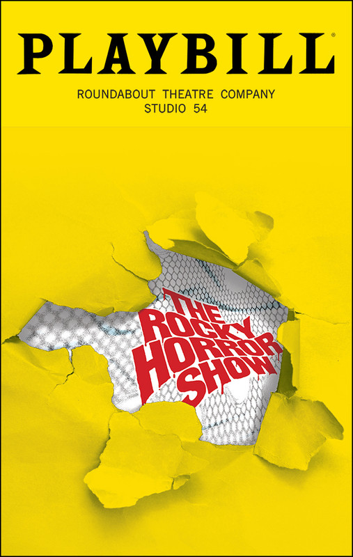
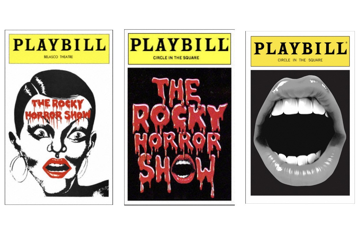
I saw this image floating around online yesterday and was kinda hoping it wasn’t real…and apparently it is. (Confirmed via Playbill Vault) This is probably one the most artistically confusing/baffling Playbills I’ve ever seen. Thoughts?
https://playbill.com/production/the-rocky-horror-show-broadway-studio-54-2026

It's certainly not a very exciting/engaging cover, IMHO, nor do I get the connection with the material.
Broadway Legend Joined: 8/26/19
I think it's on par with other strange Roundabout playbill design choices. I don't mind the ripped fishnet stockings design, but why is the image so small? Can be a cost cutting measure. Also, was the title created in WordArt?
Updated On: 2/18/26 at 07:36 AM
I need sunglasses looking at that playbill
Doesn’t really seem to align with what we’ve seen visually from the production so far.
Featured Actor Joined: 8/19/22
They didn’t even match the yellow on the cover art to the “Playbill yellow”…
Updated On: 2/18/26 at 08:24 AM
“What an eyesore. Then again, I haven’t been a fan of any of the graphics for this revival — they all look surprisingly amateurish, very ‘bus and truck.’
I wonder if there's some legal thing going on where they don't have the rights to any of the classic iconography or fonts? It's also notable that they aren't billing the show as "Richard O'Brien's The Rocky Horror Show," which I believe has been the official legal billing for the last twenty years or so.
Broadway Star Joined: 11/18/13
I've not found poster art and playbill design to be one of Roundabout's strong suits. This is on par with what I would expect from them. Safe and meh.
The logo itself sucks. Is the backdrop a fence? Is it fishnets? Why does the logo not relate to it at all? Why is it just plopped at such a weird stretched out perspective? And none of it in a "Rocky Horror"... just a bad ugly way ...
So curious to see his direction for this since Oh mary is such a hit but his other works (like the La Cage in Pasadena) were not praised.
darquegk said: "I wonder if there's some legal thing going on where they don't have the rights to any of the classic iconography or fonts? It's also notable that they aren't billing the show as "Richard O'Brien's The Rocky Horror Show," which I believe has been the official legal billing for the last twenty years or so."
To be honest--and I say this as a fan of the show for over 40 years--I've never been crazy about the "Richard O'Brien's The Rocky Horror Show" billing, but I am curious how this happened. All other materials related to this production do bill it that way.
I would actually kind of like this if the yellow matched the playbill masthead.
Considering performances don’t start for over a month, could this not just be a placeholder?
Stand-by Joined: 1/2/15
I'm not an AI expert, but that REALLY seems like someone cranked that design out on AI in 5 minutes and said it was good enough.
carlisle14 said: "I'm not an AI expert, but that REALLY seems like someone cranked that design out on AI in 5 minutes and said it was good enough."
You're certainly not.
Broadway Star Joined: 11/18/13
RippedMan said: "So curious to see his direction for this since Oh mary is such a hit but his other works (like the La Cage in Pasadena) were not praised."
For what it’s worth, His work on You Will Get Sick was divine.
Any "ripped paper with something else underneath" design will always be more eye-catching than a standard one, so, if it was a choice between just the regular full-sized torn fishnets logo (which has been in place for a while) topped with the Playbill masthead, or this, I prefer this. It's ripping open the ordinary and traditional Playbill to find the seedy and unconventional Rocky Horror Show underneath.
Updated On: 2/18/26 at 11:51 AMUnderstudy Joined: 9/26/22
I'm not a fan of this either. I thought it would have a more black, neon, Warhol vibe, like the cast announcement pieces. As someone who is a graphic designer I will never fault the designer. We don't know how many iterations were gone through, and I'm sure there were some amazing designs, but it all comes down to the client. Also, personally, this type of ripping through the playbill design seems to work far better with "Titanique"
joevitus said: "darquegk said: "I wonder if there's some legal thing going on where they don't have the rights to any of the classic iconography or fonts? It's also notable that they aren't billing the show as "Richard O'Brien's The Rocky Horror Show," which I believe has been the official legal billing for the last twenty years or so."
To be honest--and I say this as a fan of the show for over 40 years--I've never been crazy about the "Richard O'Brien's The Rocky Horror Show" billing, but I am curious how this happened. All other materials related to this production do bill it that way."
The O'Brien holding company is very strange and selective in what it does and doesn't allow with his stuff. America gets free rein of Rocky Horror (I mean, five different professional companies within a half hour's drive of each other can present RHS on the same weekend), but are restricted to present any of his other stuff, like the Shock Treatment stage show (which I like WAY more than the movie and would love to present as a double feature with RHS).
It seems like the key art for it since it's similar to their website design. I think it works just fine, but not one of those memorable Playbills you look back on.
Kad said: "Considering performances don’t start for over a month, could this not just be a placeholder?"
This is what was posted officially on Playbill Vault which, to my understanding, is going to be their design, at least initially until the monthly cycle comes around and it can be changed
I think it would've been more effective (and appropriate) if the fishnet had been placed in the foreground, with the logo designed as a tattoo showing through a tear in the fabric.
This is the original Playbill cover for the original 1975 Broadway production and the 2 different ones issued for the 2000 Broadway revival: 
quizking101 said: "Kad said: "Considering performances don’t start for over a month, could this not just be a placeholder?"
This is what was posted officially on Playbill Vault which, to my understanding, is going to be their design, at least initially until the monthly cycle comes around and it can be changed"
But it is weird that the Richard O’Brien credit is everywhere else for this production but not the playbill cover.
Videos