Broadway Legend Joined: 10/13/05
My one issue is that Coalhouse sticks out like a sore thumb. It would be better if the quality of his image was toned down to look more antique, and he was place below the words, rather than above them, that way the eye wouldn't be distracted away from the title. Everything else looks lovely, though.
Which agency is doing this show? I don't see it listed on Serino-Coyne or SpotCo's websites.
Just my opinion, but I saw this production in DC, and this logo doesn't seem to capture the feel of it at all. I think it's odd that Coalhouse is represented so literally when the piano is part of the rainbow. That aspect feels very disjointed to me. If they're going to use that gradient, why not a logo that incorporates Mother and Tateh on the ends as well, giving viewers a sense of the links between the three cultures? Three separate "colors" that ultimately will blend and melt into one another, so to speak. The name alone conjures images of the music and period, so focusing so squarely on Coalhouse feels redundant to me. Finally, for a production that's aiming to be more intimate than the behemoth original, that's an awfully big, blocky font. Just my opinion.
I like it, but... somethings off, can't quite place it.
They made some really bizzare changes since the original image that was floating around. Look how much bigger his butt is now compared to the original...
Updated On: 8/13/09 at 04:01 PM
What's with the gay flag theme, though?
Broadway Legend Joined: 11/8/08
^ DAMN YOU!!! I was just about to post the same joke.
Broadway Legend Joined: 2/15/05
Now it looks like the Evita revival logo from London.
The new logo reminds me of those pictures you made in elementary school where you drew patches of colour all over a piece of paper, covered it with a black pastel and then scraped off the black pastel to make a picture.
*shrugs*
Maybe it's just me...
i like it, but would have rather they had just used red, blue and a little purple. More patriotic, less......gay.
Broadway Legend Joined: 2/15/05
The design of the show, and the show in general just all seems so classy, and this logo....eh, not so much.
I would agree that it's too gay. You know it's an issue when people on a Broadway message board are pointing that out.
Broadway Legend Joined: 7/27/05
I actually don't mind the picture itself so much as the style of the text. Yikes.
Oh goodness. I do not like it. At all.
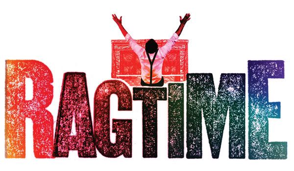
As I keep looking at it, I keep trying to figure out where the brilliant idiots who came up with this logo got the idea from. I'm attempting to somehow connect this with the production I saw here in DC, and I'm just drawing a blank.
So many of my issues with this has already been said by others: the unneccessary rainbow, Coalhouse's Evita-esque pose, the fact that only Coalhouse is the one in the picture, when really, this logo should be representing the three racial/social groups that the actual musical is focused on... I could go on, but I'd rather not.
And further, I can't comprehend why people claim this is better than what they had at the Kennedy Center. KC's logo, I feel, did a much better job at capturing the setting of the show, and made it clear to audiences (who weren't already aware) that this is a period-piece. But, whatever. Everyone's entitled to their own opinions.
I guess it really doesn't matter. The Original production's logo trumps them all, the way I see it.
~Ash was here
Past 12 Months On Stage:
24 Hour Plays: Otawri (Other Black Woman, 9/11), Hairspray (Shayna, 11/18-21) Twelve Angry Men (5th Juror, 12/9-11), Wilson Winter One-Acts: Mannequins (Bloomingdales Salesperson, 2/11-12), Twelfth Night (Maria, 3/24-26), 30 Plays in 60 Minutes (Various Roles, 6/4), Ragtime (Sarah, 8/11-13)Current Avatar: Me looking quite sleepy. This shot gives you a nice view of my various posters: ITH, Hair, The Lion King, the list goes on...
I don't know what this musical is about.
And this design is not piquing interest.
THIS logo piques your interest more than...
THIS one?! (Changes were made. It's not a rainbow)
I like the Coalhouse at the piano idea. It focuses on the fact that "Ragtime" as a genre/style of music is the perfect metaphor for the country at the turn of the century.
While I get the rainbow concept, I think it's misplaced here. It looks like something Jesse Jackson would use on a campaign flier.
Broadway Legend Joined: 11/8/08
I honestly don't get the Rainbow concept.
TheActr97J - No, neither of the designs pique my interest. The 2nd is clearly a step up though.
You'd think, especially given the new sense of optimism and patriotism the election of Obama brought to the country, that they'd play up the Americana angle a little.
This looks like an ad for a piano bar in Chelsea.
The first logo is NOT the final logo. The second one is. There is no more rainbow. It's gradients of red and blue, which to me is a clear comment on what the show is about.
The final logo would definately look big if all the letters were the same size... And the designers went totally presidential including Coalhouse in the picture. It may not win the Best Revival, but at least it's politically correct XD
Like I said, I think it's good - but why did they mak Coalhouse's ass so big?
To accommodate you, Taz.
Videos