new Ragtime logo
#1new Ragtime logo
Posted: 8/13/09 at 8:25am
I couldn't get a jpeg on it. but it is on their site
http://www.ragtimebroadway.com/
I like it.
#2re: new Ragtime logo
Posted: 8/13/09 at 8:42amFAAAAMMMMEEEE! I'M GONNA LIIIVEEE FOREEEVVEEERRR!!!
#3re: new Ragtime logo
Posted: 8/13/09 at 8:52am

hahaha you are right, its the fame logo
#4re: new Ragtime logo
Posted: 8/13/09 at 8:53am

#5re: new Ragtime logo
Posted: 8/13/09 at 8:56amIn this version, does Sarah go to an "audition" with a guy she met at a diner?
#6re: new Ragtime logo
Posted: 8/13/09 at 8:57amI'm not sure, but I'm pretty sure the firefighters have a huge acrobatic dance break on the top of the model T.
#7re: new Ragtime logo
Posted: 8/13/09 at 8:58amI actually really like it. Though having seen the Kennedy Center production, I feel like Mother's more of a major character than Coalhouse in this one-- it's really all about her.
#8re: new Ragtime logo
Posted: 8/13/09 at 9:01am
yeah, Mother's really out there on her own in this production. She may even want to make magic.
ok, I'm done. I just think it's hilarious.
RAGTIME RAINBOW!
beats the other logo, though.
#9re: new Ragtime logo
Posted: 8/13/09 at 9:36ami think it's fabulous.
snowskittle
Leading Actor Joined: 1/10/09
#11re: new Ragtime logo
Posted: 8/13/09 at 9:45amLOVE it.
AndAllThatJazz22
Broadway Legend Joined: 11/8/08
#12re: new Ragtime logo
Posted: 8/13/09 at 9:47amThat doesn't look like the turn of the century at all. HORRIBLE artwork.
-Danmeg's 10 year old son.
AndAllThatJazz22
Broadway Legend Joined: 11/8/08
#13re: new Ragtime logo
Posted: 8/13/09 at 9:47am

Maybe they should take a more literal approach.
-Danmeg's 10 year old son.
#14re: new Ragtime logo
Posted: 8/13/09 at 11:06amhaha Allthatjazz that would certainly boost ticket sales! I for one dont think its terrible artwork at all.
"I am sorry but it is an unjust world and virtue is only triumphant in theatricle performances" The Mikado
#15re: new Ragtime logo
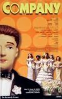
Posted: 8/13/09 at 11:11amNominally better than the art for the KC production. Photoshop filters trying to mask bad typography. It looks like a student project to me.
#16re: new Ragtime logo
Posted: 8/13/09 at 11:16amI still think it's far too modern for a turn of the century musical. It's better than the Kennedy Center one, though.
RentBoy86
Broadway Legend Joined: 2/15/05
#17re: new Ragtime logo
Posted: 8/13/09 at 11:18amI feel like the set for this one though is almost too modern. It has these huge, cold steel structures. I think the logo suits it, but I don't care for it. It looks like he's doing "evita hands" above the title.
#19re: new Ragtime logo
Posted: 8/13/09 at 11:30amMake them Hear you Argentina!
#20re: new Ragtime logo
Posted: 8/13/09 at 11:46am
I'm so glad I'm not the only one who thought of Fame when I saw that logo.
The balcony set design is reminiscent of the French Quarter; it doesn't appear modern at all if you've actually seen it.
Wanting life but never knowing how
BumbleWumble
Chorus Member Joined: 12/25/04
#21re: new Ragtime logo
Posted: 8/13/09 at 12:00pmI thought the same thing, orangeskittles. It looks like New Orleans more than New Rochelle.
#22re: new Ragtime logo
Posted: 8/13/09 at 12:02pmWAY too theme park.
#23re: new Ragtime logo
Posted: 8/13/09 at 1:12pmI didn't mean that it was distracting or inaccurate, just that it's obviously not a modern design. I've seen iron railings on northeast Victorian homes and older buildings in Manhattan.
Wanting life but never knowing how
#24re: new Ragtime logo
Posted: 8/13/09 at 1:24pmI like it, though, unlike most of BroadwayWorld, I don't make my decision on seeing a show based on the logo.
Videos
