

PLAYBILL Covers of the 2016-2017 Season

#25PLAYBILL Covers of the 2016-2017 Season
Posted: 8/18/16 at 12:53pm
Playbill Vault just added some new Playbills!


#26PLAYBILL Covers of the 2016-2017 Season
Posted: 8/18/16 at 12:58pm
I've been anxiously waiting to see the new artwork for Heisenberg and I love it!
As usual, Roundabout Playbills disappoint because they don't use color. I think the artwork for The Cherry Orchard looks beautiful in color, but the effect is significantly diminished in black and white.

#27PLAYBILL Covers of the 2016-2017 Season
Posted: 8/18/16 at 1:28pm
I love the new School of Rock design, but Alex is leaving in November. Still, love it!
VintageSnarker
Broadway Legend Joined: 1/30/15
#28PLAYBILL Covers of the 2016-2017 Season
Posted: 8/18/16 at 1:53pm
It might just be that there's finally some color but the cover for The Great Comet is a welcome change. I can't wait to add it to my collection. My only complaint is the way they're kind of floating.
10086sunset
Broadway Legend Joined: 2/8/16
#29PLAYBILL Covers of the 2016-2017 Season
Posted: 8/18/16 at 2:11pm
The Cherry Orchard would have been stunning in color.
orlikethecolorpurple
Featured Actor Joined: 1/28/16
@z5
Broadway Legend Joined: 11/30/15
#31PLAYBILL Covers of the 2016-2017 Season
Posted: 8/25/16 at 4:31pm
LES LIAISONS DANGEREUSES has a cover uploaded!
10086sunset
Broadway Legend Joined: 2/8/16
#32PLAYBILL Covers of the 2016-2017 Season
Posted: 8/25/16 at 4:35pm
@z5 said: "LES LIAISONS DANGEREUSES has a cover uploaded!
"
Beautiful...It's truly striking....
¿Macavity?
Broadway Star Joined: 1/29/16
#33PLAYBILL Covers of the 2016-2017 Season
Posted: 8/26/16 at 1:15am
@z5 said: "LES LIAISONS DANGEREUSES has a cover uploaded!
"
That is lovely.

#34PLAYBILL Covers of the 2016-2017 Season
Posted: 8/26/16 at 7:41am
The Les Liaisons Dangereuses Playbill is STUNNING.
"There’s nothing quite like the power and the passion of Broadway music. "

GreasedLightning
Broadway Legend Joined: 2/11/14
#35PLAYBILL Covers of the 2016-2017 Season
Posted: 8/26/16 at 9:26am


#36PLAYBILL Covers of the 2016-2017 Season
Posted: 8/26/16 at 10:41am
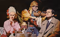
It kinda looks like Schrieber is passed out drunk to me lol, but I do agree the setting and color is beautiful.
VintageSnarker
Broadway Legend Joined: 1/30/15
#37PLAYBILL Covers of the 2016-2017 Season
Posted: 8/27/16 at 8:38pm
@buhbuhbilly I can't unsee it now. I think because of Janet McTeer's body and skirts are covering him, Liev Schreiber's body also looks weirdly broken... unless it was also photoshopped. But I hope that one stays in color for a while.
@z5
Broadway Legend Joined: 11/30/15
#38PLAYBILL Covers of the 2016-2017 Season
Posted: 8/29/16 at 11:59pm
Looks like ON Your Feet! is going black and white next month...

#39PLAYBILL Covers of the 2016-2017 Season
Posted: 9/5/16 at 1:37am

'Oh, Hello' put their playbill cover up! I like it - though, I'm surprised that it's going with the 'old' Playbill design, didn't know they were allowed to do that? I like it though, was sort of missing the white borders for some Playbills. I guess they've become normal to me!
Funny how the 'classic' playbills have became 'modern' now - also interesting to note that Off-Broadway playbills don't seem to of changed - only the Broadway playbills. But even at that, some Broadway playbills don't have the old design? Maybe it was an oversight by the Playbill Vault team. Wish they'd go back to the old Vault design - I liked having a quick guide to total perfs, total gross, avg. gross. Now you have to scroll through aeons of ticket details before reaching the no. of performances - and the old technical specifics are no longer there!
Whoops went off on a bit of a tangent there.
LightsOut90
Broadway Legend Joined: 5/2/14
#40PLAYBILL Covers of the 2016-2017 Season
Posted: 9/5/16 at 2:49am
not surprised Oh Hello is using the "old" design, fits the shows ascetics well
10086sunset
Broadway Legend Joined: 2/8/16
#41PLAYBILL Covers of the 2016-2017 Season
Posted: 9/5/16 at 12:52pm
Was hoping for more from the Oh, Hello Playbill cover...
I find it looks rather bland...
#42PLAYBILL Covers of the 2016-2017 Season
Posted: 9/6/16 at 8:24am

In Playbill's article on the new playbills for Fall, they show this as the playbill for Oh, Hello.

As @z5 mentioned, On Your Feet is going B/W this month. And... it's ugly. It's terrible.
@z5
Broadway Legend Joined: 11/30/15
#43PLAYBILL Covers of the 2016-2017 Season
Posted: 9/6/16 at 1:47pm
So true...the new cover for On Your Feet! is really underwhelming....I LOVED the cover since the new July Playbill change. It was probably one of my favorites in a long time.
curel1
Featured Actor Joined: 6/15/16
#44PLAYBILL Covers of the 2016-2017 Season
Posted: 9/6/16 at 2:48pm
Why do shows choose to go black and white? OYF was so nice before
Updated On: 9/6/16 at 02:48 PM
jacobsnchz14
Broadway Legend Joined: 12/13/06
#46PLAYBILL Covers of the 2016-2017 Season
Posted: 9/6/16 at 3:47pm
I really wish that the B&W playbills had more CONTRAST. More actual black instead of mostly greys that make it seem washed out and as everyone always complains "Ugly."
Keeping BroadwayWorld Illustrated
orlikethecolorpurple
Featured Actor Joined: 1/28/16
#47PLAYBILL Covers of the 2016-2017 Season
Posted: 9/10/16 at 10:25am
I love the Falsettos Playbill. 
orlikethecolorpurple
Featured Actor Joined: 1/28/16
#48PLAYBILL Covers of the 2016-2017 Season
Posted: 9/10/16 at 10:27am
And The Great Comet has changed theirs. Beautiful. 
#49PLAYBILL Covers of the 2016-2017 Season
Posted: 9/10/16 at 11:08am
Love Love Love, the Falsettos and the new Great Comet covers!
Videos