

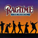
And the "Worst Logo of theYear" award goes to RAGTIME
Yankeefan007
Broadway Legend Joined: 3/20/04

nearthestage
Stand-by Joined: 1/19/09
#2re: And the 'Worst Logo of theYear' award goes to RAGTIME
Posted: 8/6/09 at 7:26amNo disagreement here. Horrible.

#2re: And the 'Worst Logo of theYear' award goes to RAGTIME
Posted: 8/6/09 at 7:28am
The sepia tone is icky. It looks more like peepee-a tone..
Black and white would look so much nicer.

#3re: And the 'Worst Logo of theYear' award goes to RAGTIME
Posted: 8/6/09 at 8:08am
Normally, I like sepia-toned antique photos.
But this is just drab. And the colored graphics just look amateur.
BrodyFosse123
Broadway Legend Joined: 2/27/06
#4re: And the 'Worst Logo of theYear' award goes to RAGTIME
Posted: 8/6/09 at 8:21am
Screw you all. My neighbor's 4 year old son did that logo. It took him about an hour, between distractions from Spongebob Squarepants and his WII.
Geez! Give the kid a break!

#5re: And the 'Worst Logo of theYear' award goes to RAGTIME
Posted: 8/6/09 at 8:50amOh my gosh, that is awful! They should just use the logo from the original production.
"You drank a charm to kill John Proctor's wife! You drank a charm to kill Goody Proctor!" - Betty Parris to Abigail Williams in Arthur Miller's The Crucible
Chrysanthemum62001
Broadway Legend Joined: 2/14/04
#6re: And the 'Worst Logo of theYear' award goes to RAGTIME
Posted: 8/6/09 at 8:50amI do not understand. Maybe they will change it.
"What a mystery this world. One day you love them and the next day you want to kill them a thousand times over." The Masked Bandit in THE FALL

#7re: And the 'Worst Logo of theYear' award goes to RAGTIME
Posted: 8/6/09 at 9:07amThat's what they used at the Kennedy Center.
Like a firework unexploded
Wanting life but never knowing how
Wanting life but never knowing how

desiree armfeldt
Broadway Star Joined: 1/8/07
#8re: And the 'Worst Logo of theYear' award goes to RAGTIME
Posted: 8/6/09 at 9:16amIt's atrocious! I love sepia and I think red/blue make sense, but the two don't blend at all!

#9re: And the 'Worst Logo of theYear' award goes to RAGTIME
Posted: 8/6/09 at 9:22amIt looks like the cover of a self-published novel. Truly unfortunate.

Smaxie
Broadway Legend Joined: 9/26/05
#10re: And the 'Worst Logo of theYear' award goes to RAGTIME
Posted: 8/6/09 at 9:29amThat's the logo from the Kennedy Center. It's not the logo for the Broadway production.
Begin at the beginning and go on till you come to the end: then stop.

#11re: And the 'Worst Logo of theYear' award goes to RAGTIME
Posted: 8/6/09 at 9:38amLet's hope not.
Genius lasts longer than beauty.

#12re: And the 'Worst Logo of theYear' award goes to RAGTIME
Posted: 8/6/09 at 9:38amRegardless of what production it's for, the lettering reminds me of what was used in Grease the movie.
"I don't want the pretty lights to come and get me."-Homecoming 2005
"You can't pray away the gay."-Callie Torres on Grey's Anatomy.
Ignored Users: suestorm, N2N Nate., Owen22, master bates

#13re: And the 'Worst Logo of theYear' award goes to RAGTIME
Posted: 8/6/09 at 9:46amAwful. Not enticing in the least.
....but the world goes 'round

TulitaPepsi
Broadway Legend Joined: 7/13/04
#14re: And the 'Worst Logo of theYear' award goes to RAGTIME
Posted: 8/6/09 at 9:47am
For me, the main problem is the typeface - it's too early, dating from the 1870s-1880s. And its badly placed, spaced and is too large for the 'window' that holds it.
I like the idea of sepia, but it does make the poster look awfully drab.
I think the FINIANS RAINBOW logo is equally bad.
"Hurry up and get into your conga clothes - we've got to do something to save this show!"
Updated On: 8/6/09 at 09:47 AM

#15re: And the 'Worst Logo of theYear' award goes to RAGTIME
Posted: 8/6/09 at 9:49amWow, that's ugly.
"Jaws is the Citizen Kane of movies."
blocked: logan2, Diamonds3, Hamilton22
blocked: logan2, Diamonds3, Hamilton22

winston89
Broadway Legend Joined: 6/18/06
#16re: And the 'Worst Logo of theYear' award goes to RAGTIME
Posted: 8/6/09 at 9:58amThat makes me think of a that a school would use for their production of the show and not one that is slated for Broadway.
"If you try to shag my husband while I am still alive, I will shove the art of motorcycle maintenance up your rancid little Cu**. That's a good dear"
Tom Stoppard's Rock N Roll
fgreene1938
Leading Actor Joined: 10/25/06
#17re: And the 'Worst Logo of theYear' award goes to RAGTIME
Posted: 8/6/09 at 10:26amThat's definitely a low-budget poster. Hopefully, the BW production will have a better one.
#18re: And the 'Worst Logo of theYear' award goes to RAGTIME
Posted: 8/6/09 at 10:39am
It looks like it was designed and approved by people who have never seen the show.
EDIT: Or never listened to ragtime music, for that matter.
"Jaws is the Citizen Kane of movies."
blocked: logan2, Diamonds3, Hamilton22
Updated On: 8/6/09 at 10:39 AM
blocked: logan2, Diamonds3, Hamilton22
#19re: And the 'Worst Logo of theYear' award goes to RAGTIME
Posted: 8/6/09 at 10:43am
For me, the main problem is the typeface - it's too early, dating from the 1870s-1880s.
If it were too late, I could see the problem, but just because the typeface was from the 1880s doesn't mean it couldn't have been used 20 years later in the time period of the show. That's like saying Times New Roman can't be used for contemporary shows. It's not like people just give up and stop using them ten years after they were designed.
Kennedy Center posters have never been attractive. I have four windowcards from the Sondheim Celebration. Sunday and Passion are good graphically, but Merrily and Sweeney are just plain ugly.
Like a firework unexploded
Wanting life but never knowing how
Updated On: 8/6/09 at 10:43 AM
Wanting life but never knowing how

CurtisTaylorJr2
Leading Actor Joined: 3/17/06
#20re: And the 'Worst Logo of theYear' award goes to RAGTIME
Posted: 8/6/09 at 10:52amI've seen better work done by people who use Microsoft Paint.
#21re: And the 'Worst Logo of theYear' award goes to RAGTIME
Posted: 8/6/09 at 11:40amI think if the font and color were changed a bit, and that blue box behind the title was gone, it wouldn't be so bad. It's the blue box that really stands out, in my opinion.
"I don't want the pretty lights to come and get me."-Homecoming 2005
"You can't pray away the gay."-Callie Torres on Grey's Anatomy.
Ignored Users: suestorm, N2N Nate., Owen22, master bates

#22re: And the 'Worst Logo of theYear' award goes to RAGTIME
Posted: 8/6/09 at 12:03pmI swear that red is THE default red that comes up when you click the "stroke" filter. Ugh!
"This thread reads like a series of White House memos." — Mister Matt

#23re: And the 'Worst Logo of theYear' award goes to RAGTIME
Posted: 8/6/09 at 12:12pmBreaking the bank
snowskittle
Leading Actor Joined: 1/10/09
#24re: And the 'Worst Logo of theYear' award goes to RAGTIME
Posted: 8/6/09 at 12:18pmHope it's not a bad omen.