PLAYBILL Covers of the 2016-2017 Season
#125Covers of the 2016-2017 Season
Posted: 1/15/17 at 8:21am
I LOVE the Sunday Playbill.
"There’s nothing quite like the power and the passion of Broadway music. "
broadwayguy91
Broadway Star Joined: 12/23/15
#126Covers of the 2016-2017 Season
Posted: 1/15/17 at 10:16am
LOVED the first Significant Other playbill cover, the 2nd one is meh.
(possibly because 4x Gideon Glick is better than 1x Gideon Glick. but that's just me. heh)

#127Covers of the 2016-2017 Season
Posted: 1/15/17 at 11:41am
I LOVE the Sunday playbill! It's classy and looks like a painters palette where they mix colors and stuff.
BroadwayRox3588
Broadway Legend Joined: 10/5/16


#129Covers of the 2016-2017 Season
Posted: 1/24/17 at 4:52pm
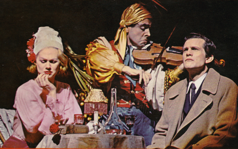
Is that a photograph of Sally Field in the rehearsal room?

#130Covers of the 2016-2017 Season
Posted: 1/24/17 at 4:56pm
CATSNYrevival said: "Is that a photograph of Sally Field in the rehearsal room?
"
Weren't the photos on the front page playbill also taken from rehearsals? I feel Like it's becoming a trend
In our millions, in our billions, we are most powerful when we stand together. TW4C unwaveringly joins the worldwide masses, for we know our liberation is inseparably bound.
Signed,
Theater Workers for a Ceasefire
https://theaterworkersforaceasefire.com/statement
#131Covers of the 2016-2017 Season
Posted: 1/24/17 at 5:00pm
Call_me_jorge said: "CATSNYrevival said: "Is that a photograph of Sally Field in the rehearsal room?
"
Weren't the photos on the front page playbill also taken from rehearsals? I feel Like it's becoming a trend
It's what Scott Rudin seems to do now with all of his playbills. The Crucible was the same thing. They have these arbitrary pics from rehearsals or the show themselves without much context.
A little swash, a bit of buckle - you'll love it more than bread.
VintageSnarker
Broadway Legend Joined: 1/30/15
#132Covers of the 2016-2017 Season
Posted: 1/24/17 at 6:16pm
It makes it feel like they forgot about the Playbills and then had to scramble to get something up last minute. There are a lot of talented photographers but for many campaigns I'm often left thinking that the photo they chose can't be the best photo that was taken. If it was, they should have tried a little harder.

#133Covers of the 2016-2017 Season
Posted: 1/24/17 at 7:13pm
Definitely a rehearsal room image. However, The Front Page, The Crucible and Blackbird changed their Playbills after opening night. I'm assuming the same will happen here.

#134Covers of the 2016-2017 Season
Posted: 1/24/17 at 7:26pm
They change their Playbills a few days after previews start.
You can also try a little harder.
"When the audience comes in, it changes the temperature of what you've written." -Stephen Sondheim
10086sunset
Broadway Legend Joined: 2/8/16
#135Covers of the 2016-2017 Season
Posted: 1/24/17 at 7:26pm
Happen to like the Scott Ruden pattern...One for previews and one post...
The same happened for Shuffle Along, although they went back to the original image they used in previews...
@z5
Broadway Legend Joined: 11/30/15
#136Covers of the 2016-2017 Season
Posted: 1/24/17 at 9:00pm
Though the Humans did stay consistent throughout the whole run. I am kind of digging Glass Menagerie one though. Rudin seems to like more candid photos on playbills, like the second Blackbird one was an incredibly powerful image.
#137Covers of the 2016-2017 Season
Posted: 1/24/17 at 9:34pm
I don't mind the photographs, especially for plays, I just hadn't noticed him using rehearsal photos before this.
#138Covers of the 2016-2017 Season
Posted: 1/25/17 at 12:17am
THE HUMANS made sense using a production photo since it was an Off-Brodway transfer.
"When the audience comes in, it changes the temperature of what you've written." -Stephen Sondheim
Updated On: 1/25/17 at 12:17 AM
#139Covers of the 2016-2017 Season
Posted: 1/25/17 at 6:52am
It was occasionally done this way back in the 60's, especially early on when no production photos had been taken yet. I think it's quite beautiful.

Keeping BroadwayWorld Illustrated
#140Covers of the 2016-2017 Season
Posted: 1/25/17 at 8:58am
I like it a lot too.
A little swash, a bit of buckle - you'll love it more than bread.
#141Covers of the 2016-2017 Season
Posted: 1/25/17 at 9:56am
It's kindof interesting that in today's internet age the Playbill cover has come to be its own form of promotion. That's why I love when it isn't just the poster art with a yellow header, especially love the Rudin trend towards production photos.
Keeping BroadwayWorld Illustrated

GreasedLightning
Broadway Legend Joined: 2/11/14
#142Covers of the 2016-2017 Season
Posted: 2/3/17 at 11:46pm
The Vault has removed the Sally Field cover of Menagerie. Wonder if they're changing design.


#145Covers of the 2016-2017 Season
Posted: 2/15/17 at 12:37pm
Wow all of those look great. Still don't understand why Groundhog Day is doing this whole simplistic design, but it's ok.
BroadwayConcierge
Broadway Legend Joined: 7/24/15
#146Covers of the 2016-2017 Season
Posted: 2/15/17 at 12:57pm
Sweat, Charlie, and Groundhog Day are honestly just terrible, to me. Sweat especially.
The best ones are easily Amélie, Anastasia, The Play That Goes Wrong, and Miss Saigon.
Thanks for sharing them all, wish!
10086sunset
Broadway Legend Joined: 2/8/16
#147Covers of the 2016-2017 Season
Posted: 2/15/17 at 1:16pm
Happen to really like Bandstand, along with Amelie, Anastasia, Saigon and The Play That Goes Wrong.
Sweat looks so flat...Present Laughter isn't much better...
VintageSnarker
Broadway Legend Joined: 1/30/15
#148Covers of the 2016-2017 Season
Posted: 2/15/17 at 3:51pm
Amelie is cute. Though perhaps the red is a little aggressive and doesn't reflect how colorful (that is, the variety of colors) the show is. It would also be nice to have more contrast between the raspberries and the background. I also wonder if it means they're changing her wig. I hope so. Her expression is perfect though.
I love the Anastasia one. I'm glad they're sticking with that artwork.
I know it's Charlie and the Chocolate Factory and not Willy Wonka but I'm a little surprised they didn't feature any of the cast or at least some imagery to represent the show a little more. They're really banking on name recognition of the property.
The stark look of Groundhog Day will be good when people start getting those Playbills signed but it doesn't do much to sell the show.
Miss Saigon is the same art but it looks fantastic.
I get the concept of The Play That Goes Wrong but... meh.
I can't tell what Sweat is about from that Playbill.
I'm hoping to add Amelie, Anastasia, and Miss Saigon to my collection. And to see those shows, of course!
@z5
Broadway Legend Joined: 11/30/15
#149Covers of the 2016-2017 Season
Posted: 2/15/17 at 5:13pm
War Paint was also uploaded online...just like most of these, they are the same advertisement art for the most part; nothing too surprising.
Videos