

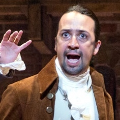
PLAYBILL Covers of the 2016-2017 Season

GreasedLightning
Broadway Legend Joined: 2/11/14
#150Covers of the 2016-2017 Season
Posted: 2/15/17 at 5:59pm
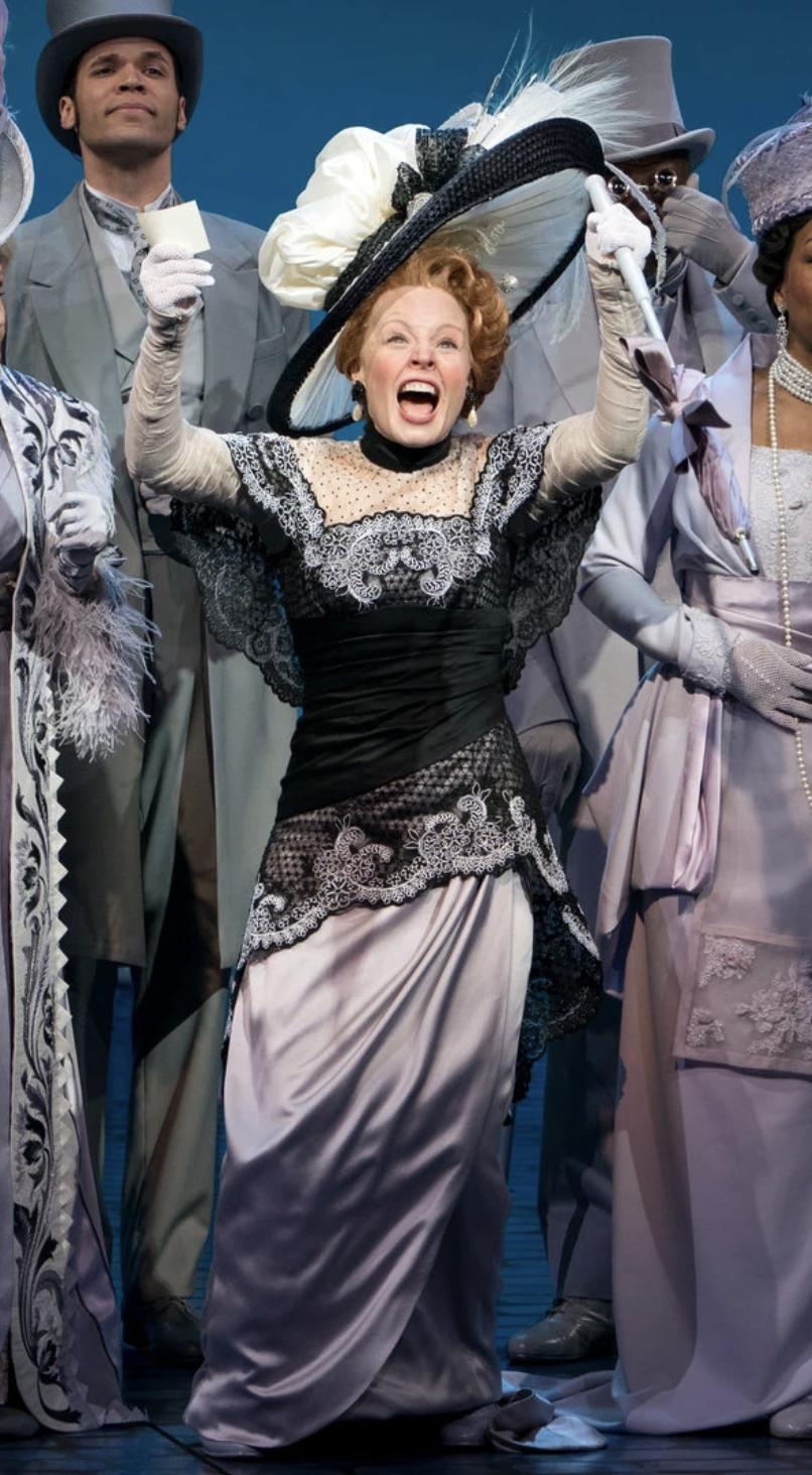
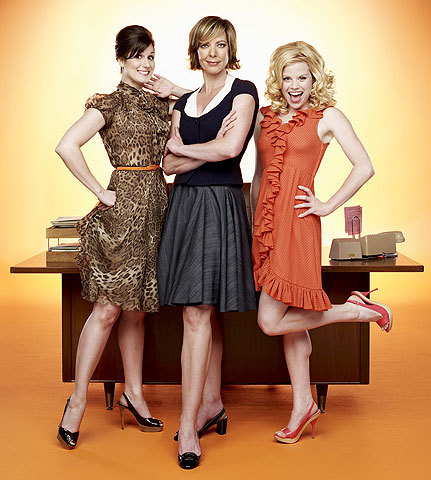
War Paint is UGLY.
I would post the image but I am on my phone.
#151Covers of the 2016-2017 Season
Posted: 2/15/17 at 6:07pm

I don't see any big problems with it. It's fine.

#152Covers of the 2016-2017 Season
Posted: 2/20/17 at 12:07am

whoops! Got beaten to it. I think it's really boring honestly, the faces aren't very attractive, nor do they pair well with the color scheme. I just wish they'd done so much more. A show about two dueling makeup maestros - and this is what they come up with? It lacks some oomph, in my opinion.
I might just be one of the only people who actually like the art for Sweat, but I agree that it's difficult to ascertain the tone of the show from it. But from seeing it, I think it does fit some of the more frenzied moments in the show. It sort of gives me indie movie poster vibes. I also think being in B/W is a disservice to it.
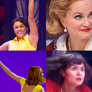
I love Amelie & Oslo especially. Wonderful colors on the Oslo playbill. Too much white space on the Groundhog Day & Play That Goes Wrong playbill, which makes both of them look quite ugly.

#153Covers of the 2016-2017 Season
Posted: 2/20/17 at 12:12am
@z5 said: "War Paint was also uploaded online...just like most of these, they are the same advertisement art for the most part; nothing too surprising.
"
What's a recent example where the playbill cover didn't relate to the advertising?
In our millions, in our billions, we are most powerful when we stand together. TW4C unwaveringly joins the worldwide masses, for we know our liberation is inseparably bound.
Signed,
Theater Workers for a Ceasefire
https://theaterworkersforaceasefire.com/statement
GreasedLightning
Broadway Legend Joined: 2/11/14
#154Covers of the 2016-2017 Season
Posted: 2/20/17 at 12:17am
Call_me_jorge said: "@z5 said: "War Paint was also uploaded online...just like most of these, they are the same advertisement art for the most part; nothing too surprising.
"
What's a recent example where the playbill cover didn't relate to the advertising?
"
All of Scott Rudin's productions.
@z5
Broadway Legend Joined: 11/30/15
#155Covers of the 2016-2017 Season
Posted: 2/20/17 at 12:39am
Call_me_jorge said: "@z5 said: "War Paint was also uploaded online...just like most of these, they are the same advertisement art for the most part; nothing too surprising.
"
What's a recent example where the playbill cover didn't relate to the advertising?
"
Besides for the Rudin shows (with the exception of Shuffle ALong) American the American Psycho cover, know-it-all. :)
GreasedLightning
Broadway Legend Joined: 2/11/14
#156Covers of the 2016-2017 Season
Posted: 2/20/17 at 12:52am
@z5 said: "Call_me_jorge said: "@z5 said: "War Paint was also uploaded online...just like most of these, they are the same advertisement art for the most part; nothing too surprising.
"
What's a recent example where the playbill cover didn't relate to the advertising?
"
Besides for the Rudin shows (with the exception of Shuffle ALong) American the American Psycho cover, know-it-all. :)
"
Woof. You really showed me!
10086sunset
Broadway Legend Joined: 2/8/16

carolinaguy
Broadway Star Joined: 10/13/06
#158Covers of the 2016-2017 Season
Posted: 2/20/17 at 8:40am
War Paint has a bit of a creepy vibe. They look bald, too.
Miss Saigon is one of my favorite designs of all time. I love the slight tweaks in the new version, with the watercolor-like strokes in the background.
Just remembering you've had an "and"
When you're back to "or"
Makes the "or" mean more than it did before
Updated On: 2/20/17 at 08:40 AM
VintageSnarker
Broadway Legend Joined: 1/30/15
#159Covers of the 2016-2017 Season
Posted: 2/20/17 at 9:32am
somechrysanthemumtea said: "
whoops! Got beaten to it. I think it's really boring honestly, the faces aren't very attractive, nor do they pair well with the color scheme.
Those are... their faces? They're selling it on Lupone and Ebersole. Whose faces did you want them to use? I like that it quickly communicates that the two characters are connected but in opposition.
It might have helped to crop the image lower so you're still emphasizing the makeup but the characters don't just look bald. Or maybe they could have done the hair in the more muted tones of the background colors. But I don't have a major issue with it.
@z5
Broadway Legend Joined: 11/30/15
#160Covers of the 2016-2017 Season
Posted: 3/8/17 at 10:44am
Looks like Beautiful changed their cover...it's bland and black and white.


#162Covers of the 2016-2017 Season
Posted: 3/9/17 at 2:07pm
Groundhog Day looks as though it's a show put on by the Public. The Beautiful cover was great before and this is just boring and awful.
BroadwayConcierge
Broadway Legend Joined: 7/24/15
#163Covers of the 2016-2017 Season
Posted: 3/9/17 at 2:34pm
Wow, I hate to be negative, but every single one of those playbills is pretty terrible.
curel1
Featured Actor Joined: 6/15/16
pupscotch
Broadway Star Joined: 1/24/16
#165Covers of the 2016-2017 Season
Posted: 3/9/17 at 2:45pm
I actually quite like Groundhog Day's. It's better than the more boring art they had before. Indecent and Beautiful are both so boring and plain. I loved Beautiful's last cover, I hope they switch it up again soon.
VintageSnarker
Broadway Legend Joined: 1/30/15
#166Covers of the 2016-2017 Season
Posted: 3/9/17 at 2:47pm
Hmn... Groundhog Day is... a choice. Unless those colors have something to do with the show, I don't get it. It reminds me of something... maybe a style of album covers? Regardless, it's nothing relevant to the show. Also, having two of the Andy Karl images in pink and having the main female lead in pink communicates nothing. A graphic should quickly communicate some message about the show. This isn't saying anything.
I don't mind Six Degrees of Separation.
BakerWilliams
Leading Actor Joined: 2/1/16
#167Covers of the 2016-2017 Season
Posted: 3/9/17 at 2:52pm
I love the Little Foxes one.
#168Covers of the 2016-2017 Season
Posted: 3/9/17 at 3:06pm
Indecent's logo design is simple enough, but then they decided to go and take the interesting red color away from the font? What the heck?
I tweeted that Chocolate Factory's logo looks like a crown underneath a ribbon of toothpaste, and their account actually replied...but they were really good-natured about it.
Miss Saigon has always been one of my favorite logos and it's classic, so I'm glad they just played with the colors there.
I LOVE the War Paint font style/color, but I still say the two faces should have been split down the middle ala "Me, Myself, and Irene" or "The Ides of March."
Sunday's Playbill looks bright and gorgeous as the new tenant in my Binder!
Lastly, I'm a little obsessed with the Amelie artwork and color scheme. It puts me in such a good mood. Anastasia's cover also looks great.
http://puccinischronicles.wordpress.com
@z5
Broadway Legend Joined: 11/30/15
#169Covers of the 2016-2017 Season
Posted: 3/9/17 at 10:28pm
Significant Other seems to be going black and white next month.
magic0214
Swing Joined: 11/27/12
#170Covers of the 2016-2017 Season
Posted: 3/9/17 at 10:39pm
The Six Degrees one isn't the worst, but it would be more striking with the color from the promotional artwork.
Your daily reminder that Christine Ebersole was a cast member on SNL.
Updated On: 3/9/17 at 10:39 PM
#171Covers of the 2016-2017 Season
Posted: 3/10/17 at 11:35am
I wonder if beautiful is going to change the playbill cover when publicity pics of Abby come in.
In our millions, in our billions, we are most powerful when we stand together. TW4C unwaveringly joins the worldwide masses, for we know our liberation is inseparably bound.
Signed,
Theater Workers for a Ceasefire
https://theaterworkersforaceasefire.com/statement
10086sunset
Broadway Legend Joined: 2/8/16
#172Covers of the 2016-2017 Season
Posted: 3/10/17 at 12:31pm
Six Degrees of separation really needs to be in color.
Could Indecent maybe have tried? Wow, its just brutal.
JustAnotherNewYorker
Broadway Star Joined: 12/20/16
#173Covers of the 2016-2017 Season
Posted: 3/10/17 at 12:32pm
Love the Playbill for "The Play that Goes Wrong"

10086sunset
Broadway Legend Joined: 2/8/16
#174Covers of the 2016-2017 Season
Posted: 3/10/17 at 12:54pm
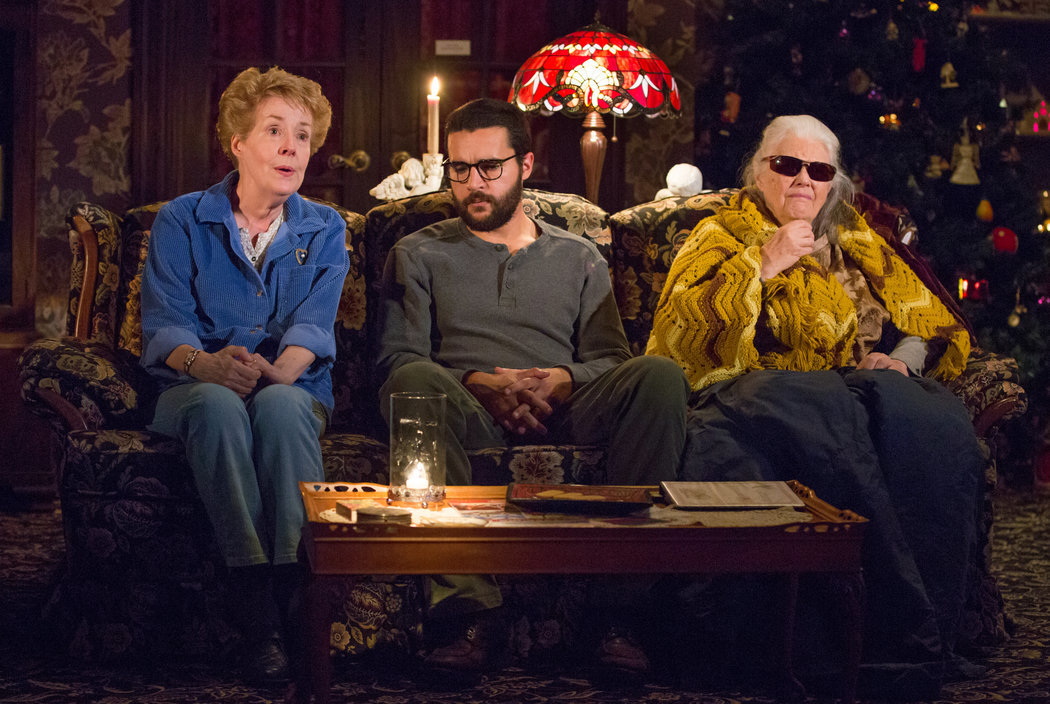
I'm surprised The Glass Menagerie hasn't changed.