Ad Evolution: SMASH on NBC

Broadway Legend Joined: 12/13/06
Ad Evolution: SMASH on NBC#1
Posted: 1/21/12 at 11:21am
http://www.emrahyucel.com/tr/post/smash-key-art-exploration
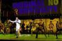
Here are eight of the original concepts for the SMASH artwork... these are very interesting ideas, it just looks like some of them don't work. If you like any of these, which one do you prefer?

Ad Evolution: SMASH on NBC #2
Posted: 1/21/12 at 11:24amI still chuckle whenever I see "The Monday After The Super Bowl."
Ad Evolution: SMASH on NBC #3
Posted: 1/21/12 at 11:39amCan someone please explain to me the concept of the final ad? They look like like they're trying to make a human Christmas tree but with the wrong colors. Why the hell are they all touching each other?
Ad Evolution: SMASH on NBC #4
Posted: 1/21/12 at 11:40amWhere's the one where they're making a human centipede?
Broadway Legend Joined: 5/15/03
Ad Evolution: SMASH on NBC #5
Posted: 1/21/12 at 11:49am
Wow,
Where have I been? I have seen nothing about this show called Smash!
Enough already.

Ad Evolution: SMASH on NBC #7
Posted: 1/21/12 at 12:33pm
You have been getting sick for a while now Jordan, you should probably put a shirt on. JK.
Like most others on this message board I am sitting here with my mouth open. NBC can shove Megan Hilty as far down my throat as they can get her. I have been anticipating her rise to stardom since I have herd about this project, Dorothy of Oz etc.
Maybe SMASH's portrayal of Theatre is not exactly accurate but Spielberg's endorsement of this show is an endorsement for theatre and if this show is a success it would encourage more people to go see a Broadway show. Which could possibly help our favorite productions stay open a little longer. (I know its a long shot but this is primetime)
They need to ensure this project they have spent millions of dollars on is not going to flop and If that means we have to look at character cards or vote for winner on a show we have not seen, so be it. I will personally take each episode as a UFC match waiting for the Katharine McPhee knock out.
Besides if you don't have the patients for a few SMASH promos and your on a broadway forum all day, then how are people who watch un-comedy like 30 Rock and Modern Family going to handle this? Let's be a little more supportive this is great for the community. I like the first ad, the 5th ad and the 8th ad in the link, but I think they wen't with the right one. :)
Please don't respond with grammar and spelling corrections. It's a Saturday. I will cut off your junk and give it to the Fiddler on the Roof.

Ad Evolution: SMASH on NBC #9
Posted: 1/22/12 at 2:33pm
GET OVER IT.
There's really no way to please anyone. If there was no promotion, people would complain that no one knew about it, or that it got shafted because it's about theatre.
And when they're promoting the hell out of it, trying to find an audience and specifically targeting the likely-to-watch theatre community, and people are complaining that there's too much promotion.
Broadway Legend Joined: 8/14/05
Ad Evolution: SMASH on NBC #10
Posted: 1/22/12 at 2:43pmI'm sick of the show already. OVER EXPOSURE.
Ad Evolution: SMASH on NBC #11
Posted: 1/22/12 at 2:51pmAll I see is Meron and Zadan recycling the same look/promotion from their producing of Chicago.

Ad Evolution: SMASH on NBC #12
Posted: 1/23/12 at 5:02amI don't think any of them are great (which is surprising as I think the designer usually does memorable ad concepts) but i have to agree I really don't understand the human pyramid ones they went with... Yes, I get it's meant to be one star ising to the top, etc, etc, but it is just so visually blah to me, I can't believe it was chosen.

Ad Evolution: SMASH on NBC #13
Posted: 1/23/12 at 10:16amI don't like any of them. The visual style has been too trendy for too long. Though I fell out of favor with Glee, their marketing ads at least appeared more original.
Ad Evolution: SMASH on NBC #14
Posted: 1/23/12 at 11:08am
The only one I actually like is the third one, there seems to be at least something going on there, instead of just awkwardly looking sexy into the camera.
Edit: I forgot to count the main picture, so the fourth one, with the yellow background.
Updated On: 1/23/12 at 11:08 AM

Leading Actor Joined: 3/21/11
Ad Evolution: SMASH on NBC #15
Posted: 1/23/12 at 11:21am

"Yeah, no. I mean, I used to like Smash back when it was on vinyl. But now, man? I mean, it's just so overexposed."
This must be a new record, even for this board. From zero to bitter before the show even premieres! If you want to bitch about overexposure, why not bitch about how BroadwayWorldTV has become the Daniel Radcliffe channel.
Ad Evolution: SMASH on NBC #16
Posted: 1/23/12 at 11:37am
Daniel Radcliffe is SO 2011. Isn't he like 70 now?
I guess people are tired of getting Smashed already.


Broadway Star Joined: 5/3/11
Ad Evolution: SMASH on NBC #18
Posted: 1/24/12 at 12:01am
I both can't stand and adore the bitchiness of this forum.
I for one, am looking forward to Smash, and I hope it becomes successful. More Brian d'Arcy James, please.

Broadway Star Joined: 3/19/09
Ad Evolution: SMASH on NBC #19
Posted: 1/24/12 at 1:09amI think they chose the right one, the others are weird and for most of them it's too easy to see that everyone is photoshopped together
Ad Evolution: SMASH on NBC #20
Posted: 1/24/12 at 1:32amI guess it's hard to sellthe concept and they wanted to emphasize the personalities and the faces some may recognize, etc (which I assume is partly why the one they choose at least shows Christian Borle fairly front and center considering he was a major player in the pilot--sopme of the other choices have him kinda lurking in the shadows). I get that it's about stardom, etc, but I still don't really get the concept of the human pyramid--or that weird one with everyone pointing out to the upper left corner, except for a few people pointing the other way...

Ad Evolution: SMASH on NBC #21
Posted: 1/24/12 at 6:15amWay too many ads. Way too much exposure.
blocked: logan2, Diamonds3, Hamilton22
Ad Evolution: SMASH on NBC #22
Posted: 1/24/12 at 8:50amI have no idea if this show will be a hit or not, but if it does fail, at least they won't be able to blame it on limited exposure. I feel like I've seen that main poster everywhere I've looked this month.
Ad Evolution: SMASH on NBC #23
Posted: 1/24/12 at 7:58pmWhile I do think it's overexposed--I really can't blame NBC. this is the first major project Greenblatt (sp?) brought to them since moving from Showtime to help head NBC, they surely know how little faith audiences currently have in dramas on NBC, and it's an expensive and risky show for them.
Videos

.jpg?format=auto&width=365)