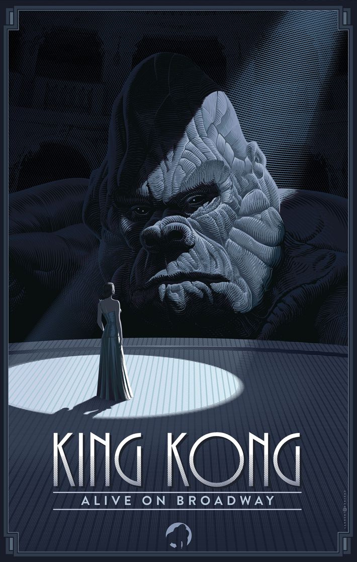
I really do not like any of the three final posters. I really did like the preliminary one with the building turning into his arm; its creative, sleek, and unexpected. But all three of the final posters, particularly the middle and right one, are so boringly obvious. Rather then making me curious about what it will be like onstage, it makes me want to just save my money and watch the movie at home. Nothing draws me in on how this will be any different, let alone 'improved', as a musical.
They might be better off showing the Empire State Building instead of Kong. That's real. I also hope they brought Kong to New York on a super tanker instead of on a raft. That makes an iota of sense.
The Laurent Durieux design (the spotlight) makes the most sense as a way of conveying "this is King Kong on stage" and you get the best sense of the puppet.
Also, that one SpotCo design where it looks like Ann is floating feels "Shape of Water"-y to me.
The comic-book artist design makes it seem like Ann and Kong are going to solve crimes together.
I wish we got to see more of this kind of professional art taking on Broadway shows and less of the questionable caricatures.