New PORGY AND BESS artwork
#1New PORGY AND BESS artwork
Posted: 10/11/11 at 4:54pm
Personaly, I love it!
#2New PORGY AND BESS artwork
Posted: 10/11/11 at 4:57pm
Is that four different logos now? I wish they would pick one already. I like the logo they used on the Richard Rodgers marquee the best.
Updated On: 10/11/11 at 04:57 PM
#3New PORGY AND BESS artwork
Posted: 10/11/11 at 5:25pmThat looks like it should hang outside Madame Tussaud's
#4New PORGY AND BESS artwork
Posted: 10/11/11 at 5:35pmAmazing. Dark, moody and evocative. The logo really shines. Best design I've seen in a while.
CAX
Featured Actor Joined: 8/12/09
#6New PORGY AND BESS artwork
Posted: 10/11/11 at 6:29pmThe thing that occurred to me the moment I saw it was it looks like the poster for CARMEN JONES. That said, I'm super curious about the show.
Brick
Broadway Legend Joined: 11/21/06
#8New PORGY AND BESS artwork
Posted: 10/11/11 at 7:39pmYES! It really evokes CARMEN JONES. Also Audra looks stiff and uncomfortable, like she's saying under her breath, "Take the damn picture already!"
#9New PORGY AND BESS artwork
Posted: 10/11/11 at 8:01pmAudra looks like she's posing for a Harlequin Romance book cover.
#10New PORGY AND BESS artwork
Posted: 10/11/11 at 8:40pmThat's what it made me think of. A cheap romance novel cover.
Gaveston2
Broadway Legend Joined: 6/28/11
#11New PORGY AND BESS artwork
Posted: 10/11/11 at 9:01pm
^^^^
And exactly as they intended, I'm sure, Kad.
I guess we've come full circle in the "democratization" of American culture: we now make our operas look like pulp fiction.
But I'm glad to see they found a way to use the Porgy-board: they made a sign out of it!
#12New PORGY AND BESS artwork
Posted: 10/11/11 at 9:18pm
But the "Porgy board" (sounds Swedish) is carried through in the background. It's a gorgeous design closer to a Goldenage of Hollywood poster than it is Harlequin romance.
But, different strokes... etc.
FindingNamo
Broadway Legend Joined: 7/22/03
#13New PORGY AND BESS artwork
Posted: 10/11/11 at 9:33pmI think it's a very wise move. The poster highlights the only two reasons anybody could have to see the show. The limited engagement is an admission that Norm and Audra are exactly what this show has to offer. Nothing more and nothing less.
#14New PORGY AND BESS artwork
Posted: 10/11/11 at 10:01pmAfter all the clap-trap they've been spewing about avoiding stereotypes, caricatures, etc, THIS is what we're getting??? Audra was right, artifice isn't easy.
Mattbrain
Broadway Legend Joined: 11/23/05
#15New PORGY AND BESS artwork
Posted: 10/11/11 at 10:43pmHow come there's no squid in the picture? Audra DID say the show is like a squid!
#16New PORGY AND BESS artwork
Posted: 10/11/11 at 10:49pm
How is this a stereotype? These are poses in the production that both actors make (albeit...not necessarily together, if memory serves).
That said, I'm elated that this is coming to Broadway and this new poster only makes me more excited about seeing it again.
#17New PORGY AND BESS artwork
Posted: 10/11/11 at 11:01pmIt looks as if he's singing, "Bess! You are my woman now! You are! You ARE!"
#18New PORGY AND BESS artwork
Posted: 10/11/11 at 11:45pm
Is that how her hair looked in the Boston production?
(and the dress also?)
Would a slum junkey ho have that do?
#19New PORGY AND BESS artwork
Posted: 10/11/11 at 11:51pmPretty accurate, but only for the first few scenes.
timote316
Broadway Legend Joined: 7/20/04
#20New PORGY AND BESS artwork
Posted: 10/12/11 at 12:04amYeah, pretty accurate.... though she wasn't quite as model-esque in the show.
#21New PORGY AND BESS artwork
Posted: 10/12/11 at 12:08am
The actual logo is fine.
And this isn't as bad as Audra's Herbal Essences advertisement. I mean, 110 in the Shade poster.
#22New PORGY AND BESS artwork
Posted: 10/12/11 at 1:39am
They're obviously trying to evoke a sense of classiness and melodrama linked to old Hollywood glamour. That interp is there on the surface for the taking and no doubt many will, and the advertisers will have done their job.
The romance novel interp people I feel are close, as cheese and tackiness is apparent, but not obvious.
Ultimately, it's the disconnect between Norm and Audra that leaves me cold. Audra seems to be rolling her eyes at Diane Paulus and Norm seems overly careful not to notice her cleavage. In other words, seems like two different pictures taken apart and photoshopped together rather clumsily. It doesn't gel.
But I totally dig the colors and logo design choices.
Unknown User
Joined: 12/31/69
#24New PORGY AND BESS artwork
Posted: 10/12/11 at 3:28am
Too funny (well at least to me...) Last night I was catching up on a few weeks of New Yorkers, and read Hilton Als' (a theatre critic I agree with more often than not) piece on Porgy and Bess which is also a review, and a sort of defence (specifically to Sondheim) about the new production.
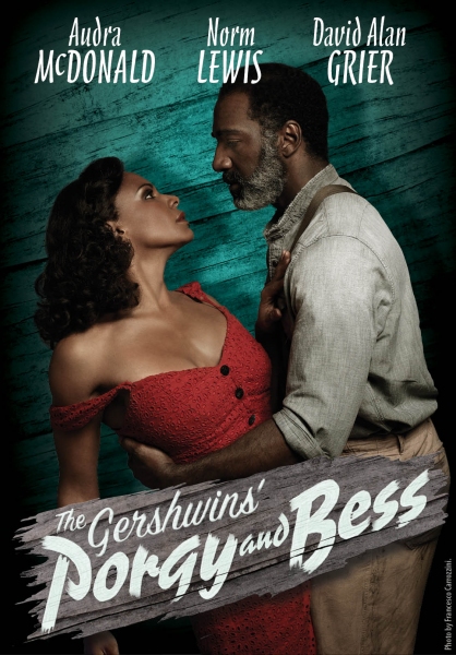
It was in the Style issue which has a number of, by New Yorker standards, really glossy photosgraphs for the articles, and they had that same photo, but without the type. I assumed it was just so, well, glam, to fit into the theme of the Style issue. It seemed ironic though, as Als' admits that previously, he was most familiar with the Otto Preminger film version (which seemed odd to me, as it seems relatively hard to track down). The quote is:
I am most familiar with Otto Premingers bodice-ripping, omen-soaked 1959 film version, starring Sidney Poitier and Dorothy Dandridge, which James Baldwin called grandiose, foolish, and heavy with the stale perfume of self-congratulation."
And, to me, that photo practically screams out exactly what he criticizes the film for being, and praises this production for not being.
The full article is available to non subscribers here: http://www.newyorker.com/arts/critics/atlarge/2011/09/26/110926crat_atlarge_als?currentPage=1
It's well written and raises some interesting and valid points (it does sound like DuBose's original novel is awfully overwritten, as Als says), although I'm still not convinced by the examples given of making the piece more three dimensional (he seems to have seen the original ending Paulus used), nor the final quote that seems to imply people shouldn't write about a culture or minority they're not a part of, unless that group isn't allowed to do so themselves (which seems odd as Als has spoken a lot about gay writers being able to write straight characters, etc, etc).
Videos


