

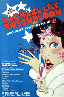
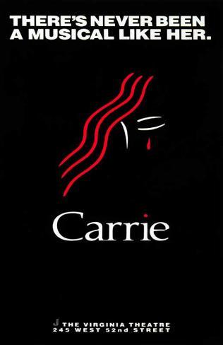
Ugliest Broadway posters


Tickets From $59

Tickets From $71

Tickets From $71

Tickets From $95