Commented something to this effect on Reddit and the Redditors were not happy with me. I'm curious how y'all feel.
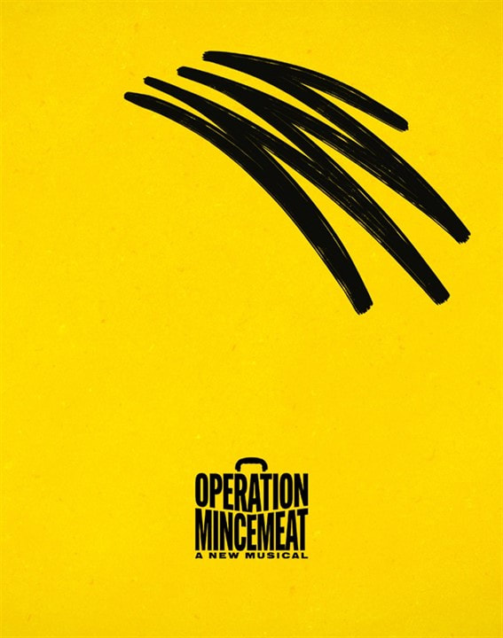
How do people here feel about the key art for this show? For those who don't know, it's a minimalist representation of Hitler. The squiggle is his hair, the briefcase is his mouth, and its handle is the moustache.
I find this kinda offensive. I'm Jewish. But, I don't mind WWII or Nazi humor. I love the way this show satirizes the Nazis. But, the logo isn't satire, it's just Hitler front and center. I suppose it's crafty to hide him in plain sight because it's a show about secrets and trickery. But, it's not a show about Hitler, it's a show about British spies, why is Hitler the logo?
In addition, I think it's just bad marketing. It's so hard to decipher, I haven't met anyone who's actually figured it out on their own. People only notice it once it's pointed out. If it hasn't been pointed out to you, it tells you absolutely nothing about the show. Combine that with the fact that the name of the show is TINY. This whole discussion came from a reddit thread where someone posted a Playbill pic and people who didn't know the show couldn't even figure out what show it was supposed to be because they couldn't read the text.
The response to me on Reddit was that people don't mind "unflattering or mocking" images of Hitler, to which my response is, how is this unflattering or mocking? Others told me that not all art has to be based on what's "most marketable" to which my response is, this is a graphic created by a marketing agency to sell the show, not high art.
I think the briefcase wordmark is awesome and something like THIS image from their instagram that combines it with the cast announcement photo would serve the show far far better as the key art. It establishes the vibe of the show, it gives you hints about what the show could be about, it far more prominently features the name of show.

Updated On: 2/17/25 at 04:49 PM