

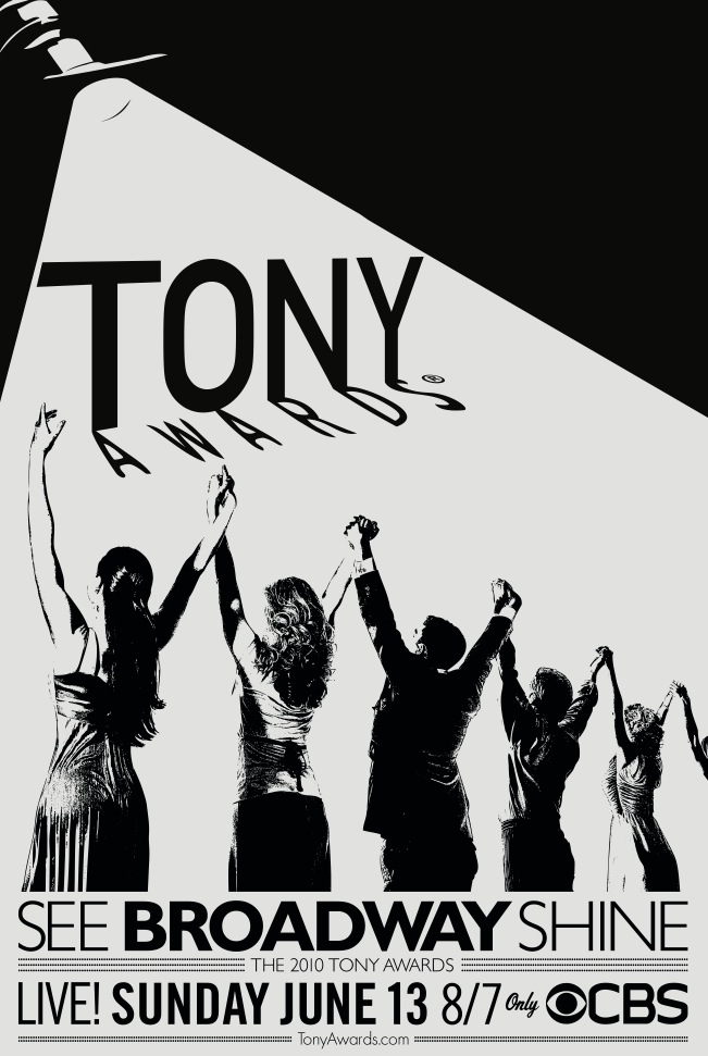
2010 Tony Awards Poster... ew
Midnight Radio
Broadway Star Joined: 5/26/07
#12010 Tony Awards Poster... ew
Posted: 4/26/10 at 9:59am
https://www.broadwayworld.com/article/2010_Tony_Awards_Poster_Art_Revealed_20100426
Discuss.
Updated On: 4/26/10 at 09:59 AM
Pianist3912
Leading Actor Joined: 7/12/07
Midnight Radio
Broadway Star Joined: 5/26/07
#22010 Tony Awards Poster... ew
Posted: 4/26/10 at 10:07am
The clothing is what really kills me. They couldn't just use silhouettes? Or have each person wearing a signature costume from different landmark productions?
It is just so... pedestrian.
#32010 Tony Awards Poster... ew
Posted: 4/26/10 at 10:09amFail
Cheyenne Jackson tickled me. AFTER ordering SoMMS a drink but NOT tickling him, and hanging out with Girly in his dressing room (where he DIDN'T tickle her) but BEFORE we got married. To others. And then he tweeted Boobs. He also tweeted he's good friends with some chick on "The Voice" who just happens to be good friends with Tink's ex. And I'm still married. Oh, and this just in: "Pettiness, spite, malice ....Such ugly emotions... So sad." - After Eight, talking about MEEEEEEEE!!! I'm so honored! :-)
#42010 Tony Awards Poster... ew
Posted: 4/26/10 at 10:10am
Because that would get people to watch the show...
~Steven

#52010 Tony Awards Poster... ew
Posted: 4/26/10 at 10:53amI don't hate it, but it does seem lazy. What made the designers think THAT was a relevant idea? The costumes are random...I just don't get it.
wonkit
Broadway Legend Joined: 9/30/08
Mattbrain
Broadway Legend Joined: 11/23/05
#72010 Tony Awards Poster... ew
Posted: 4/26/10 at 11:29amFor once, I have to agree with y'all. Eww.
Butters, go buy World of Warcraft, install it on your computer, and join the online sensation before we all murder you.
--Cartman: South Park
ATTENTION FANS: I will be played by James Barbour in the upcoming musical, "BroadwayWorld: The Musical."

#82010 Tony Awards Poster... ew
Posted: 4/26/10 at 11:35amThis reminds me of something a high school student would draw in an art class.
"I don't want the pretty lights to come and get me."-Homecoming 2005
"You can't pray away the gay."-Callie Torres on Grey's Anatomy.
Ignored Users: suestorm, N2N Nate., Owen22, master bates

#92010 Tony Awards Poster... ew
Posted: 4/26/10 at 11:37amI am a minimalist and monochromatic fan, but...this misses the mark on less is more.
"it's a dirty little war"

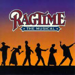
#122010 Tony Awards Poster... ew
Posted: 4/26/10 at 7:17pmYuck.
"You drank a charm to kill John Proctor's wife! You drank a charm to kill Goody Proctor!" - Betty Parris to Abigail Williams in Arthur Miller's The Crucible
#132010 Tony Awards Poster... ew
Posted: 4/26/10 at 7:21pmIt's not even a good concept. Why would black and white be a good idea on an award show poster that is intended to CATCH attention? You hang that up and no one will respond to it.

#142010 Tony Awards Poster... ew
Posted: 4/26/10 at 7:29pmIs that a high school flyer for a glee club concert?
"Jaws is the Citizen Kane of movies."
blocked: logan2, Diamonds3, Hamilton22
blocked: logan2, Diamonds3, Hamilton22
#152010 Tony Awards Poster... ew
Posted: 4/26/10 at 7:49pm
I am agog by the sheer ugliness of this poster.
It not only doesn't make me make me want to watch the broadcast, it actually makes me not want to watch it.
But when you think about it, I suppose it does capture the spirit of this mundane and boring season.
....but the world goes 'round
Actor2
Featured Actor Joined: 1/12/08
#162010 Tony Awards Poster... ew
Posted: 4/26/10 at 8:28pmDoes anyone else agree the text on the bottom of the poster is slightly redeeming? I think it looks cool, but the actual title - "Tony Awards"...No.
#172010 Tony Awards Poster... ew
Posted: 4/26/10 at 8:31pmReminds me of that nightclub scene in CONNIE & CARLA when everyone suddenly stands up, arms outstretched, singing "Don't Cry For Me Argentina."
Salve, Regina, Mater misericordiae
Vita, dulcedo, et spes nostra
Salve, Salve Regina
Ad te clamamus exsules filii Eva
Ad te suspiramus, gementes et flentes
O clemens O pia
Vita, dulcedo, et spes nostra
Salve, Salve Regina
Ad te clamamus exsules filii Eva
Ad te suspiramus, gementes et flentes
O clemens O pia

#182010 Tony Awards Poster... ew
Posted: 4/26/10 at 8:49pmThat poster might have been appropriate for the Tony Awards broadcast in 1976. Not so much for 2010.
romgitsean
Broadway Star Joined: 4/7/08
#192010 Tony Awards Poster... ew
Posted: 4/26/10 at 9:07pmI feel like they hired a thirteen year old girl who barely knows how to use Photoshop to design this.
Recent Broadway and Off-Broadway:: Carrie, Merrily, Ionescopade
Next On The List :: Clybourne Park, Once, Streetcar, BOM
Next On The List :: Clybourne Park, Once, Streetcar, BOM
PiraguaGuy2
Broadway Legend Joined: 10/10/08
#202010 Tony Awards Poster... ew
Posted: 4/26/10 at 9:12pm
THE 2010 TONY AWARDS LOGO: A GAY FANTASIA ON NATIONAL THEMES
by Tony Kushner
BOSS AT AMERICAN THEATRE WING: So Jim, we're releasing the new Tonys logo in about an hour for the press, can you email me the finished .jpeg real quick?
JIM: Yeah, no problem.
Inner monologue: Crap, I got nothing. What the hell am I gonna do?
Slowly but surely, Jim crosses to his computer and types "theatre" into his Microsoft Office Clip Art Search. He smiles.
JIM: Bingo.
Formerly SirNotAppearing - Joined 3/08

Marquise
Broadway Legend Joined: 6/1/04
#212010 Tony Awards Poster... ew
Posted: 4/26/10 at 9:16pm
I am agog by the sheer ugliness of this poster.
Amen!

#222010 Tony Awards Poster... ew
Posted: 4/26/10 at 9:45pmNow THIS will draw viewers
"I never had theatre producers run after me. Some people want to make more Broadway shows out of movies. But Elliot and I aren't going to do Batman: The Musical." - Julie Taymor 1999
#232010 Tony Awards Poster... ew
Posted: 4/26/10 at 10:31pmPERHAPS their angle is that during the broadcast, this image as it appears during the ceremony will suddenly receive "light" and the actors on the image are revealed in full color -- showing the contrast from the plain black & white to full-blast stage lights. This is the ONLY way I can see this concept being of any worth. Still, even if that's the case -- THIS IS NOT AN EYE-CATCHING POSTER! It will get lost with all the other low-budget event posters going on in New York where they get any schmuck to use Microsoft Word and clipart.
"The Spectacle has, indeed, an emotional attraction of its own, but, of all the parts, it is the least artistic, and connected least with the art of poetry. For the power of Tragedy, we may be sure, is felt even apart from representation and actors. Besides, the production of spectacular effects depends more on the art of the stage machinist than on that of the poet."
--Aristotle
--Aristotle
#242010 Tony Awards Poster... ew
Posted: 4/26/10 at 10:47pmGive me 15 minutes & I could come up with something better than this.
Videos