WAITRESS pre-Broadway artwork
jacobsnchz14
Broadway Legend Joined: 12/13/06


Tag
Broadway Legend Joined: 11/19/05
#2WAITRESS pre-Broadway artwork
Posted: 7/16/15 at 3:36pm
For those show curtain fans:
A photo posted by Scott Pask (@scottpaskstudio) on

#3WAITRESS pre-Broadway artwork
Posted: 7/16/15 at 3:38pm
yeah its ugly. I wonder if thats Jessie. Im sure this will change for Broadway just like Finding Neverland, Pippin, and Porgy and Bess
Use my fabulous TodayTix code: JEYCY
#4WAITRESS pre-Broadway artwork
Posted: 7/16/15 at 3:39pm
Dang this is the first time I've ever wanted to eat a curtain.
#6WAITRESS pre-Broadway artwork
Posted: 7/16/15 at 3:53pm
it just looks amateur to me. The font and colors are nice though
Use my fabulous TodayTix code: JEYCY

#7WAITRESS pre-Broadway artwork
Posted: 7/16/15 at 3:55pm
I like it as well! The curtain is really fun as well!
Anthony Fremont
Swing Joined: 6/16/10
#8WAITRESS pre-Broadway artwork
Posted: 7/16/15 at 3:56pm
Artwork aside, I'm glad that it's "A New Musical," as opposed to "The Musical."
Small things, but still.
Updated On: 7/16/15 at 03:56 PM#9WAITRESS pre-Broadway artwork
Posted: 7/16/15 at 3:57pm
"Artwork aside, I'm glad that it's "a new musical" as opposed to "The Musical."
Small things, but still."
YES!!!
Use my fabulous TodayTix code: JEYCY

#10WAITRESS pre-Broadway artwork
Posted: 7/16/15 at 4:05pm
That poster is bland + boring. It doesn't register with me. However, that show curtain is on the money!

GreasedLightning
Broadway Legend Joined: 2/11/14
#11WAITRESS pre-Broadway artwork
Posted: 7/16/15 at 4:06pm
I love it. The blue against the letters is an attractive mix on the apron and the lettering reminds me of the neon lights outside of most old-fashioned diners.
And that curtain! Love it.
Tom5
Broadway Star Joined: 9/23/11
#13WAITRESS pre-Broadway artwork
Posted: 7/16/15 at 4:45pm
I love the artwork!
The curtain is a cute idea.
....but the world goes 'round
#15WAITRESS pre-Broadway artwork
Posted: 7/16/15 at 8:47pm
Just curious, what kind of spin does "a new musical" have as opposed to "the musical?" This is something I'm gonna want to keep in mind when I write shows.
http://puccinischronicles.wordpress.com

AKarp2013
Broadway Star Joined: 7/25/11
#16WAITRESS pre-Broadway artwork
Posted: 7/16/15 at 9:02pm
For me, any poster that has "The Musical" under its title cheapens the show. "A New Musical" sounds a bit classier.
Updated On: 7/16/15 at 09:02 PM
Islander_fan
Broadway Legend Joined: 6/25/14
#17WAITRESS pre-Broadway artwork
Posted: 7/16/15 at 9:16pm
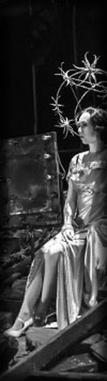
I found this picture of a model of the set in case anyone was interested. This was from an article written in a magazine Harvard Square.


#18WAITRESS pre-Broadway artwork
Posted: 7/16/15 at 11:11pm
I also prefer "A New Musical" to "The Musical." I know Wicked used the former. Do we know if we'll be seeing Waitress on Broadway this season?
I don't love the background but I think the font is terrific.
"Contentment, it seems, simply happens. It appears accompanied by no bravos and no tears."
#19WAITRESS pre-Broadway artwork
Posted: 7/17/15 at 1:12am
It will come in this season. At the ART season preview they were apparently doing prizes of some sort, and one of them was opening night tickets to Waitress on Broadway (though as far as I know, dates, theater, cast, etc. are unknown). I even asked on Facebook if it meant the show was OFFICIALLY going to NYC and they replied with a very definite yes. So unless anything changes, it will be coming in (springtime I assume).
#20WAITRESS pre-Broadway artwork
Posted: 7/17/15 at 2:04am
Its definitely eyeing a specific theatre as well. In one of Michael Riedel's article's, he said that its opening Spring 2016 in a "small shubert theatre." Im guessing the Schoenfeld, Broadhurst, and Belasco for Waitress, Tuck Everlasting, and American Psycho respectively.
Use my fabulous TodayTix code: JEYCY
#21WAITRESS pre-Broadway artwork
Posted: 7/17/15 at 7:27am
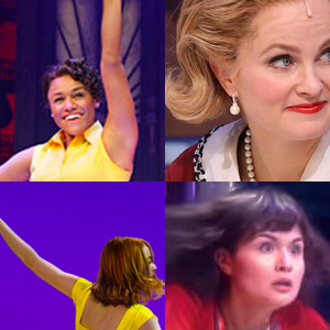
I love it, though they need an actual "logo" for a Broadway poster. It's definitely Jessie on there.
#22WAITRESS pre-Broadway artwork
Posted: 7/17/15 at 11:36am
This artwork does not have the same functional focus at ART as it would be on Bway. Also appropos of a discussion about certain Bway marquees a few days ago, there is no connection whatsoever between the design of the artwork and the design of the curtain. The former presumably emanates from ART marketing (and/or their contractor) whereas the latter is within Scott Pask's bailiwick.

#23WAITRESS pre-Broadway artwork
Posted: 7/17/15 at 11:39amYes, this artwork certainly suffices for a regional premiere. I'm sure the Broadway incarnation will be much more slick and marketable.
"...everyone finally shut up, and the audience could enjoy the beginning of the Anatevka Pogram in peace."
RW3
Broadway Legend Joined: 7/20/13

#25WAITRESS pre-Broadway artwork
Posted: 7/17/15 at 12:55pm
I have my tickets for August 4th! Very excited
Videos