

Bad or odd set designs
Ragged Tear
Understudy Joined: 2/4/05
#75Bad or odd set designs
Posted: 9/2/18 at 12:56amThe revival of Falsettos was my least favorite set for anything I’ve ever seen on Broadway.
Solipsist234
Featured Actor Joined: 5/25/18
#76Bad or odd set designs
Posted: 9/2/18 at 1:05am
seanmcdonagh121 said: "I never understood the Finding Neverland set. Honestly I thought it was hideous. The Pretty Woman set is also quite disappointing. This may also be controversial but excluding a beautiful proscenium, I felt like the set for Spongebob was only ever ‘70%’ of the way there... it just lacked something. "
I agree re: the Finding Neverland set, in that I also never really understood why it looked like that! I feel like the ART production's set made more sense than what ended up on Broadway (it kind of looked like a glorified storybook come to life onstage!) Also, what was up with those panels???
From what I've seen of the Pretty Woman set, it's incredibly bare, which is especially disappointing, considering David Rockwell designed the set!!!
#77Bad or odd set designs
Posted: 9/2/18 at 3:03am
I love the Falsettos set- it became more concrete and realistic as the characters grew and matured, and changed according to their actions and emotions. Falsettos isn't a super concrete show, and I don't think a concrete set would have done it justice. Plus, I don't think I could have been able to handle looking at a lot of complicated scenery while trying to follow all the lyrics in that show.
I'm not a huge fan of Mean Girls and Anastasia, as I feel they rely too heavily on projections. I'm studying to be a scenic designer myself and I feel the way those shows use projections are just cheap cop-outs so they didn't have to come up with any real scenery. It feels very lowbrow community theatre, but just with more money and fancy technology.
In my opinion, the best designs are the ones that either go for full realism (from a design perspective) or full concept. She Loves Me, Hello Dolly, and The Band's Visit are good examples of going realistic- the designers tried to make it feel like what they saw onstage was a real place. Great Comet, Come From Away, and Curious Incident are good examples of conceptual sets- they went so abstract that you don't need much scenery to change the setting, you just rely on the story and characters to tell you that you're in a different place. There's variation in how far you can take either side, but I really hate when shows half-ass it, like Wicked or Finding Neverland- they tried to straddle the line between the two but it just ended up as a mess.
I don't have anything against traditional sets, where there's a certain degree of realism that's often somewhat stylized (Phantom, Book of Mormon,) but I just like it better when designers think outside the box and do something different than the usual tracking and flying scenery that's different in every scene.
(Sorry this got so long, obviously I am very passionate about this!)
God, the almighty and all-knowing, has misplaced a cup?

#78Bad or odd set designs
Posted: 9/2/18 at 5:05am
I think the current Miss Saigon set is quite bad. It feels and looks like a pimped amateur production. I always cringe a little when I hear people say that it looks so raw and real now.
The original London version had a very filmic quality which really improved the moment/scene in terms of emotion/experience of their sung thoughts. For example, Last night of the world is a very intense moment for Chris and Kim, in their minds it's (maybe naively) better/more beautiful than reality. The set and lighting used to paint with that, with the turning fan, the white fabric on the bamboo bed, and at the end the impressive sliding stage moving backwards with them embracing/kissing. It really heightened the emotion as the essence is their sung thoughts.
Same goes for The Heat is on in Saigon. It used to start with the girls standing in a row and the the bar slides towards the audience, creating a theatre within a theatre, pulling the audience in. Creating intimacy on the big stage. This is especially necessary for scenes like sun and moon and why god. Centre stage, down stage, pulling the audience in. Another scene which used to be fantastic was the hotelroom, it really represented a room, and when things happened off that stage it represented another place, such as the wonderful "I still taste your kisses sequence".
With the new sets it's a big mess. Last night of the world takes place in some storage room, basically meaning the whole big black stage with small round prop; back of the bar/storage room, in the middle where they sit on. What happened to the filmic illusion of sung thoughts? It also loses intimacy.
The heat is on in Saigon takes place on that same round little bar, the scene is very messy and amateurish, especially in the Broadway revival where the girls in the opening of the song are placed on chairs and all over the place and again, it's just chairs as props on the big black stage.
Sun and moon and why god all take place in the street? Which is not intimate at all and just very odd. But I guess they had to, as the bed is somewhere far away up in a steel pipe construction, so why not avoid intimacy all together and just have these scenes taking place outdoors and on the whole big black stage again?
Room 317 is a bunch of chairs and props, again on the big black stage. Almost like an amateur production. I still taste you kisses, of course, takes place on the steel pipe construction on the street again.
The full Ho Chi Minh statue and the flags and the screens on the side of the stage, separated from the smaller theatres was also very impressive in the original.
One of the scenes that bothers me the most though is The Fall of Saigon. Instead of the beautiful scene of Kim and Chris in the bed, it is again on the stairs/steel pipe construction on the street, because they simply don't have another set. This makes doubly sure the moment does not reach intimacy once again. Then when the scene proceeds and the little fence is rolled on, it almost looks like a funny stylized amateur production. The fence does not close properly and when people put their hands up they rise above the fence. It almost looks like a dance around small separate props on the big black stage. There is no threat in this scene whatsoever. In the original production that first fence was already bigger and much more threatening, as was the staging of the whole scene. The fence was actually placed right and then when the ensemble sings "she's not the only one we'll have betrayed..." right in the second before Kim walks on and sings: "Oh Chris....I still believe...." a second fence, this time 22 feet tall is dropped from above in a split second, taking up the whole stage, which is really impressive and a slap in the face for the characters and the audience, as there is no way they could ever get over this extremely high fence and then the helicopter sequence starts where you actually see the marines get into the helicopter (this illusion is done quite well in the new version too, but that's about it).
GeorgeandDot
Broadway Legend Joined: 12/13/16
#79Bad or odd set designs
Posted: 9/2/18 at 8:39amYeah, the Mean Girls set is really unappealing. I actually have an idea for a way that they could've used projections, but just in a far more interesting way.
morosco
Broadway Legend Joined: 7/10/04
#80Bad or odd set designs
Posted: 9/2/18 at 11:29am
When people refer to use of projections in a show like Mean Girls or Anatasia I get confused because I think they aren't really using projections as much as they are using LED display screens. Am I wrong?
imklepcyk
Understudy Joined: 7/22/18
#81Bad or odd set designs
Posted: 9/2/18 at 11:41amThe on your feet set was just boring. The shutter projections made it feel boring and the colors didn't seem that vibrant
Elegance101
Broadway Legend Joined: 8/24/17
#82Bad or odd set designs
Posted: 9/2/18 at 12:52pm
morosco said: "When people refer to use of projections in a show like Mean Girls or AnatasiaI get confused because I think they aren't really using projections as much as they are using LED display screens. Am I wrong?"
No, you’re not, they both use LED screens.
broadwayboy223
Broadway Legend Joined: 7/2/14
#83Bad or odd set designs
Posted: 9/2/18 at 3:34pm
RippedMan said: "How did it serve the show? It literally was just some hanging drapes. and some bad cutouts. I've seen better sets at a community theater."
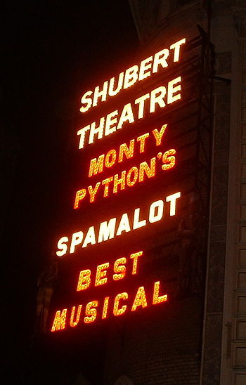
I got what James Lapine wanted with those blocks it was just ugly and It was annoying to watch the actors stack said blocks. Beautiful revival tho
Owen22
Broadway Legend Joined: 2/24/11
#84Bad or odd set designs
Posted: 9/2/18 at 3:50pm
I'm pretty sure the wonderful, original Broadway CHESS would have received better reviews if it didn't have the world's ugliest, weirdest, possibly allegorical, possibly metaphoric, strange-functioning set. It was hard to get past.

#85Bad or odd set designs
Posted: 9/2/18 at 4:22pm
morosco said: "When people refer to use of projections in a show like Mean Girls or AnatasiaI get confused because I think they aren't really using projections as much as they are using LED display screens. Am I wrong?"
This is a case of the jargon not having caught up to the technology. Kinda like saying filmed when you mean taped, and of course you don't actually mean taped either.
FWIW Anastasia lists a projection designer, whereas Mean Girls lists a video designer.

#86Bad or odd set designs
Posted: 9/2/18 at 4:28pmThe set for last season’s revival of MARVIN’S ROOM is maybe the worst I’ve ever seen on a Broadway stage.
"You travel alone because other people are only there to remind you how much that hook hurts that we all bit down on. Wait for that one day we can bite free and get back out there in space where we belong, sail back over water, over skies, into space, the hook finally out of our mouths and we wander back out there in space spawning to other planets never to return hurrah to earth and we'll look back and can't even see these lives here anymore. Only the taste of blood to remind us we ever existed. The earth is small. We're gone. We're dead. We're safe."
-John Guare, Landscape of the Body
Great Dame
Stand-by Joined: 12/2/17
#87Bad or odd set designs
Posted: 9/2/18 at 6:14pmI'm surprised by how many people don't like the Wicked set. I like the steampunk feel, and if you've read the book it makes a little more sense. Do you think that's enough to rely on though? I know most people haven't read the book, and the Time Dragon Clock is a much bigger deal in the book than in the show. Anyway, I like the Wicked set.
#88Bad or odd set designs
Posted: 9/2/18 at 6:20pm
Great Dame said: "I'm surprised by how many people don't like the Wicked set. I like the steampunk feel, and if you've read the book it makes a little more sense. Do you think that's enough to rely on though? I know most people haven't read the book, and the Time Dragon Clock is a much bigger deal in the book than in the show. Anyway, I like the Wicked set."
The problem with the Wicked set design is that if you have NOT read the book, the clock design concept makes no sense. They address the idea of a clock very briefly and in passing maybe twice during the show, yet it is the basis for the whole design. It looks cool, but the concept is not incorporated into the story of the musical.
"There’s nothing quite like the power and the passion of Broadway music. "

#89Bad or odd set designs
Posted: 9/2/18 at 6:21pm
To keep it more recent, the Pretty Woman set is so cheap-looking and so amateur. And they spent way too much time and energy on that Los Angele street sequence set hat everybody wishes they'd just move on from.
"Hey little girls, look at all the men in shiny shirts and no wives!" - Jackie Hoffman, Xanadu, 19 Feb 2008
#90Bad or odd set designs
Posted: 9/2/18 at 7:26pm
morosco said: "When people refer to use of projections in a show like Mean Girls or AnatasiaI get confused because I think they aren't really using projections as much as they are using LED display screens. Am I wrong?"
Whether it's done using LED screens or actual projectors, it's referred to in the industry as projection design. Larger theaters with more money typically use LED, while smaller theaters use projectors and screens. It's a rising field of design in the theatre world, and it all falls under the umbrella of projections.
God, the almighty and all-knowing, has misplaced a cup?
#91Bad or odd set designs
Posted: 9/4/18 at 10:13am
bwayphreak234 said: "Anastasia - The projections are hideous and made me feel like I was in Times Square. I also was not a fan of the permanent rotating walls and marble tiled deck. It looked like the whole story was set in the corner of a ballroom."
Yep, I felt the same way. Like almost the entire story took place in the same location. Also, the intense, vivid video imagery felt like an anachronism in this period story.
bwayphreak234 said: "Summer - This is one of the worst and cheapest designs I have ever seen on Broadway. The projections are laughably bad and look like clipart."
It was pretty sad. Very cruise ship.
"Michael Riedel...The Perez Hilton of the New York Theatre scene"
- Craig Hepworth, What's On Stage
#92Bad or odd set designs
Posted: 9/4/18 at 10:32am
I felt as if Anastasia, Mean Girls & Charlie and the Chocolate Factory cut corners with the set design in favor to appeal to touring houses.
The only shows I have seen benefit from heavy projection design are Dear Evan Hansen & American Psycho.

#93Bad or odd set designs
Posted: 9/4/18 at 10:52am
On A Clear Day revival.
Fugly simply fugly.
To seek revenge may lead to hell yet everyone does it but seldom as well......
Updated On: 9/4/18 at 10:52 AM
ScottyDoesn'tKnow2
Broadway Legend Joined: 1/22/14
#94Bad or odd set designs
Posted: 9/4/18 at 12:14pm
I go back and forth as to whether the Wicked set design is actually bad or not. IMO, it doesn't really function well with the way the show is directed or written. It just sort of lays there making the show seem static. However, it's a VERY distinctive set and one that people really do remember. It gives a good first impression and sets the darker color scheme of the rest of the show.
#95Bad or odd set designs
Posted: 9/4/18 at 3:33pm
One idea I never quite understood was the decision to make the floor for A Doll's House: Part 2 that orange carpeting. Not only was it unappealing to look at (and probably annoying to light), it just made no sense as to why it was that color. I could accept the marquee drop down letters that spelled the show title, but for some reason that carpet really took me out of it. The show blended period and contemporary but that carpet made no sense.
Mean Girls projections/LED screens definitely helped keep a cinematic and fast-moving pace for the show, but I thought it was the laziest cop-out of a set I've ever seen.
oknazevad
Swing Joined: 8/29/16
#96Bad or odd set designs
Posted: 9/4/18 at 3:34pm
TheSassySam said: "I felt as if Anastasia, Mean Girls & Charlie and the Chocolate Factory cut corners with the set design in favor to appeal to touring houses.
The only shows I have seen benefit from heavy projection design are Dear Evan Hansen & American Psycho."
i think you nailed it. Projections travel well, and those shows most definitely have been produced with the intent to tour either post-Broadway or concurrently if they've been successful enough. Though I'd add Curious Incident of the Dog in the Night to your lost of shows that projections worked well in.
Regina Georgia
Swing Joined: 11/3/19
#97Bad or odd set designs
Posted: 1/10/20 at 7:49pm
Gonna revive this thread.
I don’t think the lightning thief set design was that good. It was interesting in how they used it but otherwise just boring. I also know a lot of people dislike the mean girls set but I personally love it. It works with the show. I saw the sponge bob musical on tour and was a bit disappointed in how much the set had changed, but I still loved it and thought the show was amazing, and since the original broadway set took over the entire palace theatre and was more complicated, I understand why they would strip it down.
Jarethan
Broadway Legend Joined: 2/10/11
#98Bad or odd set designs
Posted: 1/10/20 at 10:35pm
Interestingly, I can think of many sets over the years that I have loved, but not as many that I thought were downright bad. May be a case of forgetting mediocrity after so many years, but retaining the best indefinitely.
Re the bad, agree re the horrible sets for both the Broadway version of Chess and Merrily We Roll Along. Both were truely awful. Chess so dark and monolithic, except for the creative mountaintop. Merrily...allI remember is bleachers; I do remember leaving the theatre trying to decide whether the sets, the costumes, the book or the direction were the worst things about the show. I have since concluded that it was the direction; which simply validated that the most brilliantly creative geniuses can have bad days (in this case, months).
Would also add:
-- Tootsie: cheesy sets for a show that cost a lot of $$ to produce. Did not understand that at all.
-- The Prom: lower budget than Tootsie, but ticket prices were the same. Tacky as hell. Looked like Summer Stock.
-- Revival of Promises Promises. They were just so plastic. The 70s were a little plastic, but plenty of shows form the 70s had great stage designs.
-- Wicked: I have enjoyed Wicked every time I have seen it, but have wondered every time also why the sets were so damned ugly. They didn't have to be that ugly.
-- Revival of Bye Bye Birdie. Just about everything to do with that production was bottom drawer...so at least consistent with the rest of the show, but really lifeless.
-- Aspects of Love -- the single best design desision was a rip-off of the only good thing about the NY Chess. I barely remember the show, but do remember that I hated everything about it, including the ugly sets.
-- Lorelei -- everything about Lorelei wreaked of bad summer stock, starting with the sets. No imagination whatsoever.
-- Seussical -- I expected some imagination, didn't get any.
PS -- I thought the sets for the revival of Hello Dolly were a thousand times better than the original production. In that production, the Harmonia Gardens was so uninspired and there were too many flats. The train station set was great, though. The revival started with the original and improved upon it exponentially.
Loved the sets for Miss Saigon. Loved the use of projections in Anastasia, probably the single thing that I liked about it. I absolved the set for the original production Fifth of July.
Dollypop
Broadway Legend Joined: 5/15/03
#99Bad or odd set designs
Posted: 1/10/20 at 10:47pmKelsey Grammer's MACBETH. It was an empty stage that had been painted black and featured actors dressed in black. A dreadful set for a dreadful production.
"Long live God!" (GODSPELL)