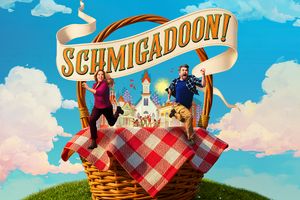
I don't think a poster/artwork will ever make or break a show, but it's one of those things that never hurts to have visually appealing (colors, design, font, etc) elements as well as something that conveys a feeling the show may evoke.
I love the Wicked artwork. It's striking, but the best part is Glinda whispering into Elphaba's and the smirk on Elphaba's face. It says SO much- they are friends and conspirators, plus it's surprising because anyone who knows the Wizard of Oz knows that Glinda and the Wicked Witch aren't friends. Glinda would never be whispering into her rival's ear, and whatever she's saying certainly wouldn't make her smile like that. The artwork doesn't tell you the plot, but it says a lot.
I think Dear Evan Hansen does the same thing. You see what looks like a young man (this show will deal with teen drama somehow) and his arm is in a cast. He's going through a hardship, a tough time. Over the cast is a hastag #youwillbefound- clearly we will be dealing with coming of age issues, finding oneself, becoming comfortable with oneself, etc. The hashtag is also not #Evanwillbefound or something of that nature, but YOUwillbefound. You, as an audience will take this journey with us. If you're a teen (or an adult) who is still finding yourself, have hope, because you too will be found. The artwork says an awful lot, to me at least.
One more example: the August: Osage Country artwork was terrific. There was a large house with all the family members in a V formation, with Violet at the apex. It just screamed big family drama. You got a strong hint of the experience you were in for.
Marie: Don't be in such a hurry about that pretty little chippy in Frisco.
Tony: Eh, she's a no chip!